1.Survey Data Segmentation and Mapping
KPI cards and grouped bar chart · 2026
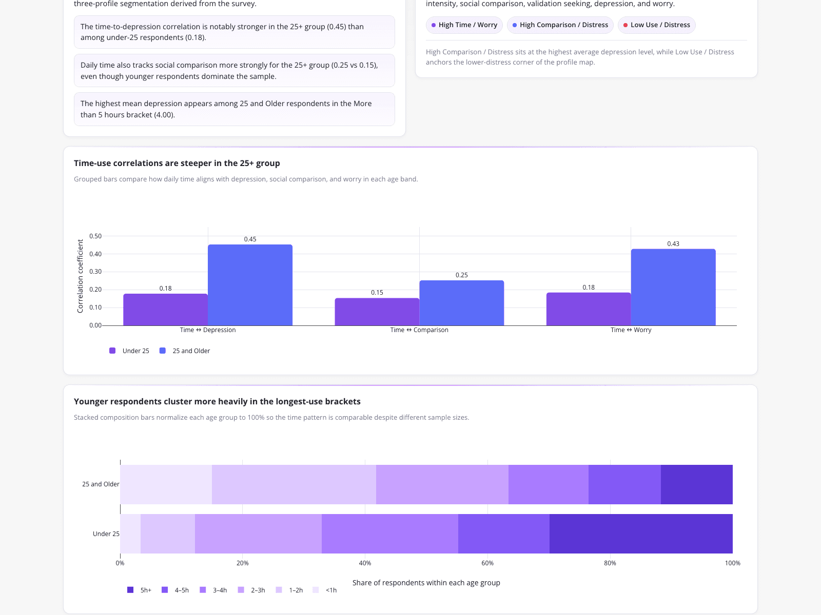
An education researcher analyzed survey data from 481 total respondents regarding adolescent social media use and mental health. The dashboard highlights a 68.2% under-25 share (328 under 25 vs 153 age 25+) and a mean depression score of 3.26 out of 5, with the highest mean depression (4.00) appearing among the 25+ demographic using social media for over 5 hours. By bypassing manual Python scripting and utilizing automated database mapping tools, the researcher avoided silent column-mapping errors to accurately compare time-use correlations, such as Time-Depression (0.45 for 25+ vs 0.18 for under 25).
What it shows:
How automated mapping prevents silent errors in multi-variable survey analysis.
#survey-analysis#mental-health#correlation-analysis