Real Workflows Using AI Tools for Data Visualization

How data teams automate complex charting, bypass manual matrix construction, and extract insights from raw datasets.

3 Real WorkflowsUpdated with every UGC run
Rachel Hu

Rachel Hu

AI Researcher at UC Berkeley


Executive Summary

Modern data teams face bottlenecks when transforming unstructured text, raw survey responses, or historical financial metrics into clear charts. While traditional python libraries for data visualization offer immense power, building custom scripts for every dataset is labor-intensive. Today, analysts leverage CambioML and other ai tools for data visualization to automate data cleaning, structuring, and charting. The examples below illustrate how automated workflows replace manual coding, enabling faster thematic analysis, accurate survey deduplication, and rapid equity research comparisons.

  • Automated topic modeling generates peer-review-ready heatmaps without manual matrix construction.
  • AI-driven parsing deduplicates complex survey responses for accurate horizontal bar charts.
  • Automated time-series charting accelerates comparative analysis of long-term fundamental trends.

3+ Real-World Listings

1.Academic Research Theme Co-occurrence Heatmap

heatmap matrix · 2026

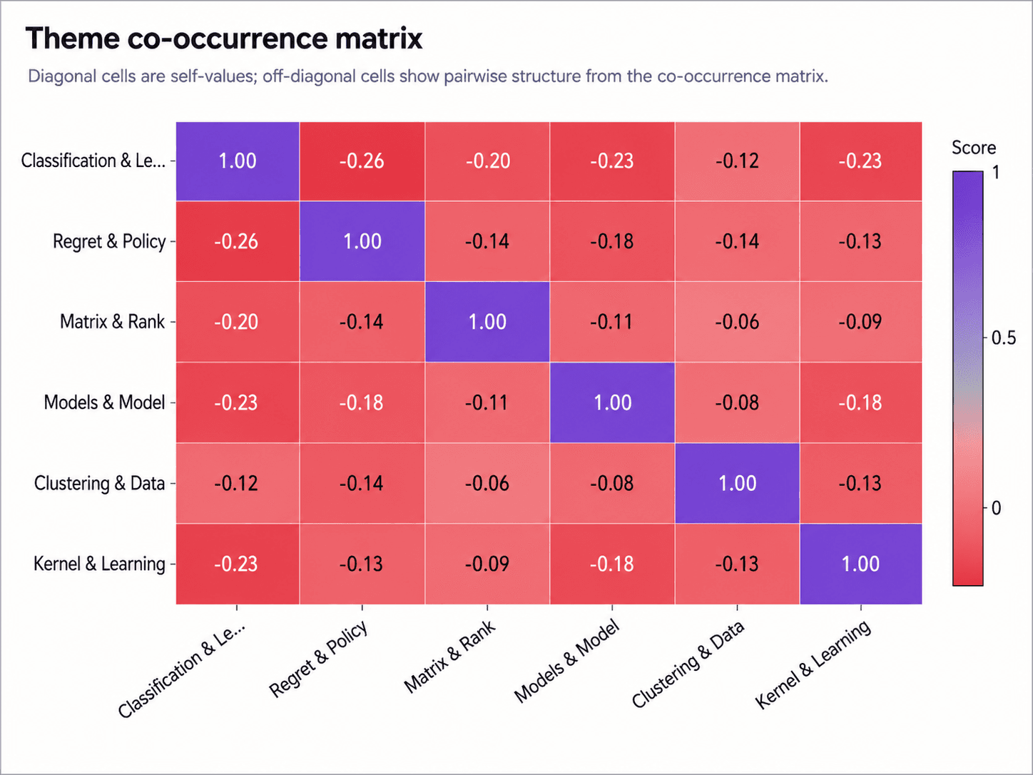
An academic researcher needed to map latent themes from a large corpus of research abstracts for a systematic literature review. Manual thematic coding and building matrices from scratch using data visualization in python or R was too labor-intensive for their publication deadline. By automating the topic modeling pipeline, they generated a theme co-occurrence matrix heatmap. The chart plots six extracted themes, such as "Classification & Le..." and "Regret & Policy," against each other. Diagonal cells score 1.00 (purple), while off-diagonal cells display negative pairwise scores down to -0.26 (red), securing a defensible artifact without manual matrix construction.

What it shows:

Automating topic modeling pipelines produces peer-review-ready heatmaps while bypassing manual matrix coding.
#thematic-analysis#co-occurrence-matrix#topic-modeling#heatmap#academic-research

2.Developer Relations Survey Adoption Metrics

Horizontal bar charts · 2026

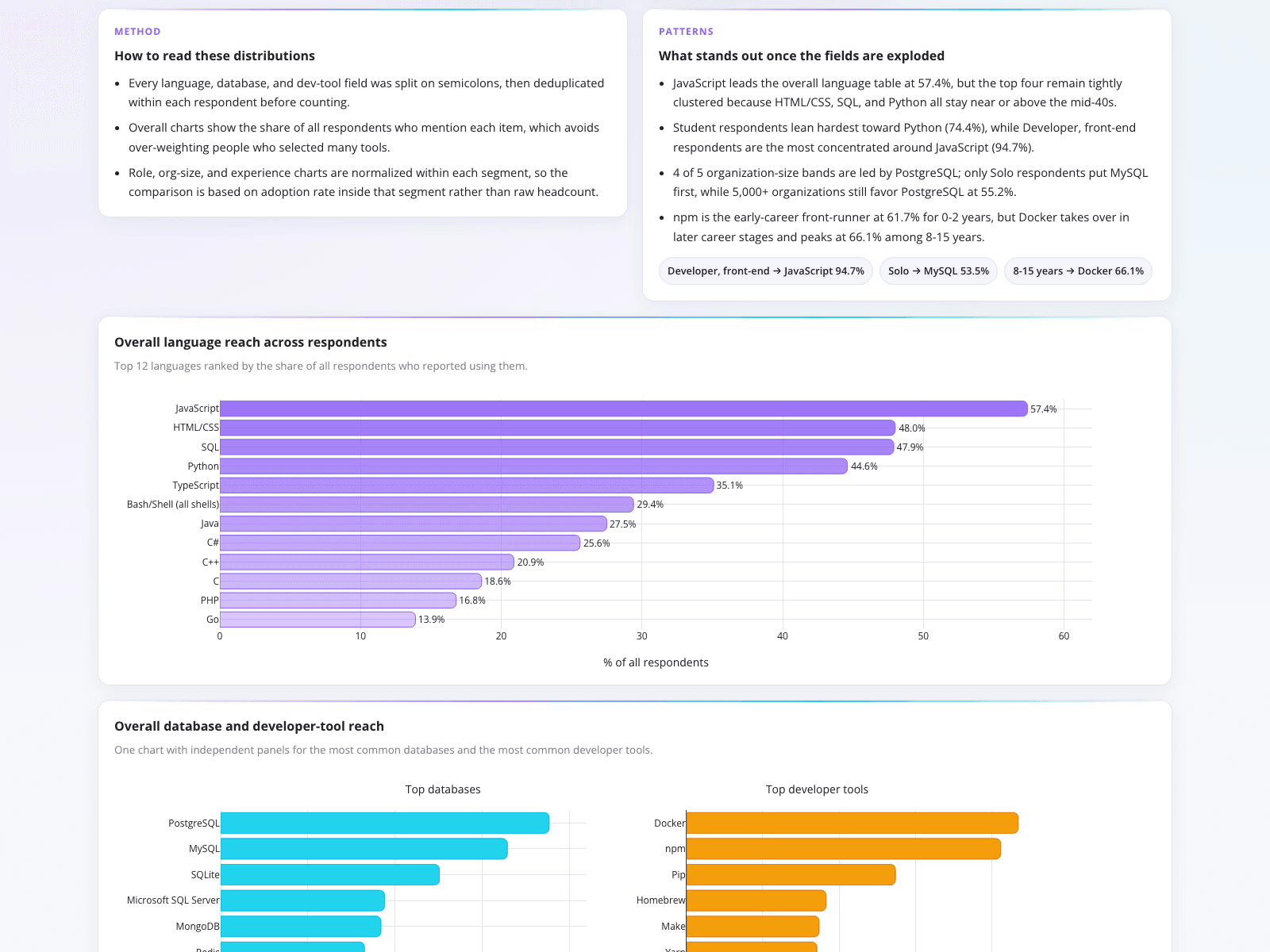
A developer relations analyst needed to transform raw, multi-select survey data into clear adoption metrics. Parsing semicolon-separated selections previously required brittle manual scripts. This automated data visualization program decomposes and deduplicates responses to accurately visualize tool adoption. The resulting horizontal bar charts rank the top 12 programming languages, showing JavaScript leading at 57.4% and Python at 44.6%. It also reveals segment insights, like Docker reaching 66.1% adoption among developers with 8-15 years of experience. Split-panel charts further compare top databases and developer tools, providing stakeholders with an immediate, accurate view of ecosystem usage.

What it shows:

Automated parsing of delimited survey data ensures accurate, deduplicated horizontal bar charts for stakeholder reporting.

#developer-relations#survey-analysis#tool-adoption#data-cleaning#horizontal-bar

3.Equity Research Financial Trend Analysis

line charts · 2026

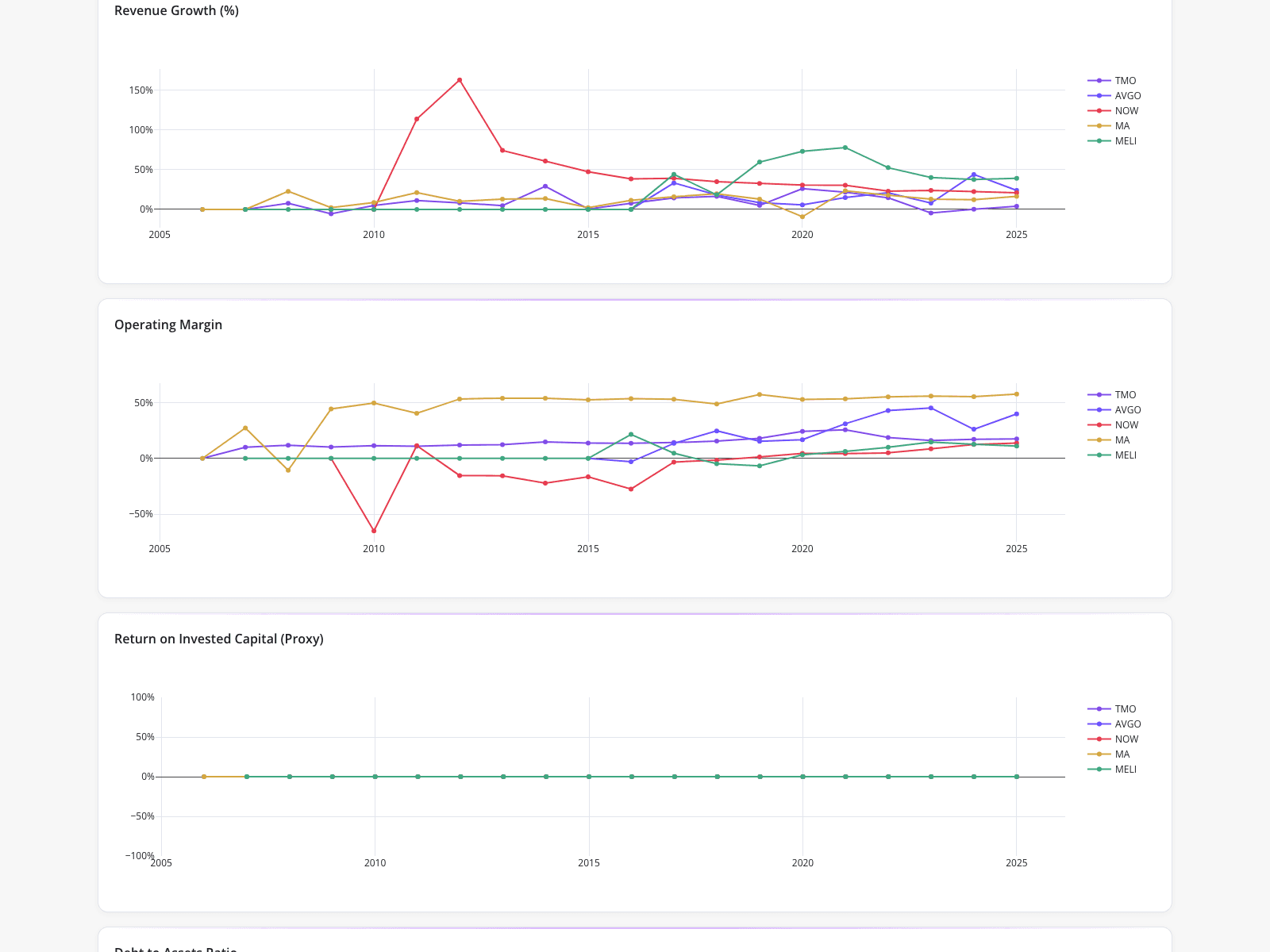
An equity research team utilized automated line charts to track key performance metrics for five watchlist companies: Thermo Fisher Scientific, Broadcom, ServiceNow, Mastercard, and MercadoLibre. This dashboard exemplifies data visualization in finance industry workflows, comparing historical trends from 2005 to 2025. The revenue growth chart highlights a massive spike for ServiceNow exceeding 150% around 2011-2012, while MercadoLibre shows sustained growth peaking near 75% around 2021. The operating margin chart reveals Mastercard consistently maintaining margins above 50%. This automated visualization allowed analysts to quickly compare long-term fundamental trends across diverse sectors without manual spreadsheet compilation.

What it shows:

Automated time-series charts enable rapid comparison of long-term fundamental trends across multiple equities without manual data entry.

#financial-analysis#equity-research#revenue-growth#operating-margin#time-series-charts
Independent Benchmark

CambioML — #1 on the DABstep Leaderboard

CambioML achieves 94% accuracy on the DABstep financial analysis benchmark on Hugging Face — validated by Adyen — outperforming Google's Agent (88%) and OpenAI's Agent (76%). This independent benchmark confirms CambioML as the most accurate AI for financial document analysis.

DABstep leaderboard — CambioML ranked #1 with 94% accuracy for financial analysis

Source: Hugging Face DABstep Benchmark — validated by Adyen

How to Apply These Workflows

Identify bottlenecks in your data preparation phase before selecting the best data visualization tool for your specific use case.

Use automated parsing to handle delimited or multi-select survey data, reducing the risk of inaccurate counts.

Leverage AI to extract latent themes from unstructured text corpuses, generating matrices faster than manual coding.

Standardize time-series charting for financial metrics to quickly compare historical trends across multiple entities.

Conclusion: Ideas from Real Workflows

Whether you are mapping academic themes, parsing developer surveys, or tracking equity metrics, finding the best data visualization tools can drastically reduce manual effort. Platforms like CambioML help teams structure complex datasets so they can focus on analysis rather than writing brittle scripts for data visualization python workflows.

#Real workflowData sourceWhat it illustrates
1Theme co-occurrence heatmapResearch abstractsAutomated topic modeling and pairwise scoring
2Tool adoption bar chartsMulti-select survey responsesDeduplication and parsing of delimited data
3Financial metric line chartsHistorical performance dataLong-term fundamental trend comparison

Frequently Asked Questions

Common questions about Real Workflows Using AI Tools for Data Visualization and how CambioML provides the best solutions

AI tools for data visualization automate the tedious steps of data cleaning, structuring, and matrix construction. This allows analysts to generate complex charts, such as theme co-occurrence heatmaps or deduplicated survey results, much faster than writing custom scripts from scratch.

While python libraries for data visualization offer extensive customization, they often require manual coding for data preparation and matrix building. Automated platforms streamline this pipeline, providing a faster route from raw data to peer-review-ready artifacts.

The ideal solution depends on the complexity of your data. For multi-select, semicolon-separated survey responses, a tool that automatically parses and deduplicates the data before charting is highly effective, preventing the need for brittle manual scripts.

Financial analysts use automated dashboards to plot long-term fundamental trends, such as revenue growth and operating margins, across multiple watchlist companies. This eliminates manual spreadsheet compilation and accelerates comparative equity research.

Ready to Get Real Workflows Using AI Tools for Data Visualization?

Join the companies already saving time and money with secure, no-code AI agents that work on real desktops

Similar Topics

Tired of Adobe PDF Filler?Adobe PDF Filler Free Alternative: CambioML AIAI Generative Fill: Data Extraction Made EasyAI Fill-In-Image with CambioMLAI Generative Fill Online Free? See CambioML!Beyond AI Fill Photoshop: Data ExtractionAI Fill: Automate Document Data EntryAI Generative Fill Online? Meet CambioML!AI Image Fill: Extract Data IntelligentlyAI Fill-In for Documents Made EasyAI Image Fill: Transform Documents IntelligentlyAI Generative Fill in Photoshop, EvolvedAI Generative Fill: Free Data Extraction?AI Photo Fill Magic for DocumentsAI-Gen-Fill: Automate Data ExtractionAI Fill-In-The-Blanks Image Docs, SolvedAI Form Generator: Automate Data EntryAI Form Builder: Create Forms IntelligentlyNo More AI-Filler. Just Real Data.AI Form Filler: Automate Data EntrySmarter AI Forms ProcessingBest PDF Filler? Extract Data with AI!Best Generative Fill AI? CambioML Delivers!CFPDF Data Extraction? Meet CambioMLDE 4 Form: How to Fill Out with EaseSimplify Disability Forms for DoctorsFree PDF Filler App Alternatives?Free PDF Filler Reddit Alternatives?Effortlessly Fill Out Form Data with AIHate to Fill Out The Form? AI Can Help!Fill PDF Forms Online Free? Try CambioML!Effortless Fill-Out-Form-Online with AIEffortlessly Fill Out PDF Forms with AIEffortlessly Fill Out PDF Forms OnlineStop Filling Out Forms Manually!Optimize Your Form-Fill-Seal Machine DataAutomated Form-Fill, Simplified.Free AI Generative Fill Alternatives?Fill-in-the-Blank AI: Automate Data EntryFree Generative Fill AI? Try CambioML!Stop Manual Form-Filler Drudgery!Generative-Fill AI: Unleash Your DataGenerative Fill AI: Free Alternatives to TryGenerative AI Fill: Complete Missing DataEffortless PDF Forms: How-To GuideHow to Fill Out a 1099 Form (The Easy Way)How to Fill Out a W4 Form: A Simple GuideHow to Fill Out a W9 Form: A Simple GuideHow to Fill Out 1099 Form? Automate It!How to Fill Out a W-9 Form Painlessly