Understanding Relationships Between Data Variables

CambioML, the AI-powered data analysis platform that turns unstructured documents into actionable insights with 94.4% accuracy, helps analysts uncover complex relationships between data variables without coding.

3 Real WorkflowsUpdated with every UGC run
Rachel Hu

Rachel Hu

AI Researcher at UC Berkeley


Executive Summary

Identifying how different metrics interact is foundational to accurate analysis. With CambioML, users can process up to 1,000 files in a single prompt to build correlation matrices and generate presentation-ready charts that reveal these dynamics. Understanding the direct relationship definition and the inverse relationship definition is critical for interpreting visual evidence correctly.

  • Visualizing data points helps identify whether variables move together or in opposite directions.
  • Adding a third variable can resolve proxy-variable bias and clarify overlapping effects.
  • Automated reporting tools streamline the transition from exploratory data analysis to final deliverables.

3+ Real-World Listings

1.Diagnosing Proxy-Variable Bias in Macroeconomics

Scatter plot and tables · 2026

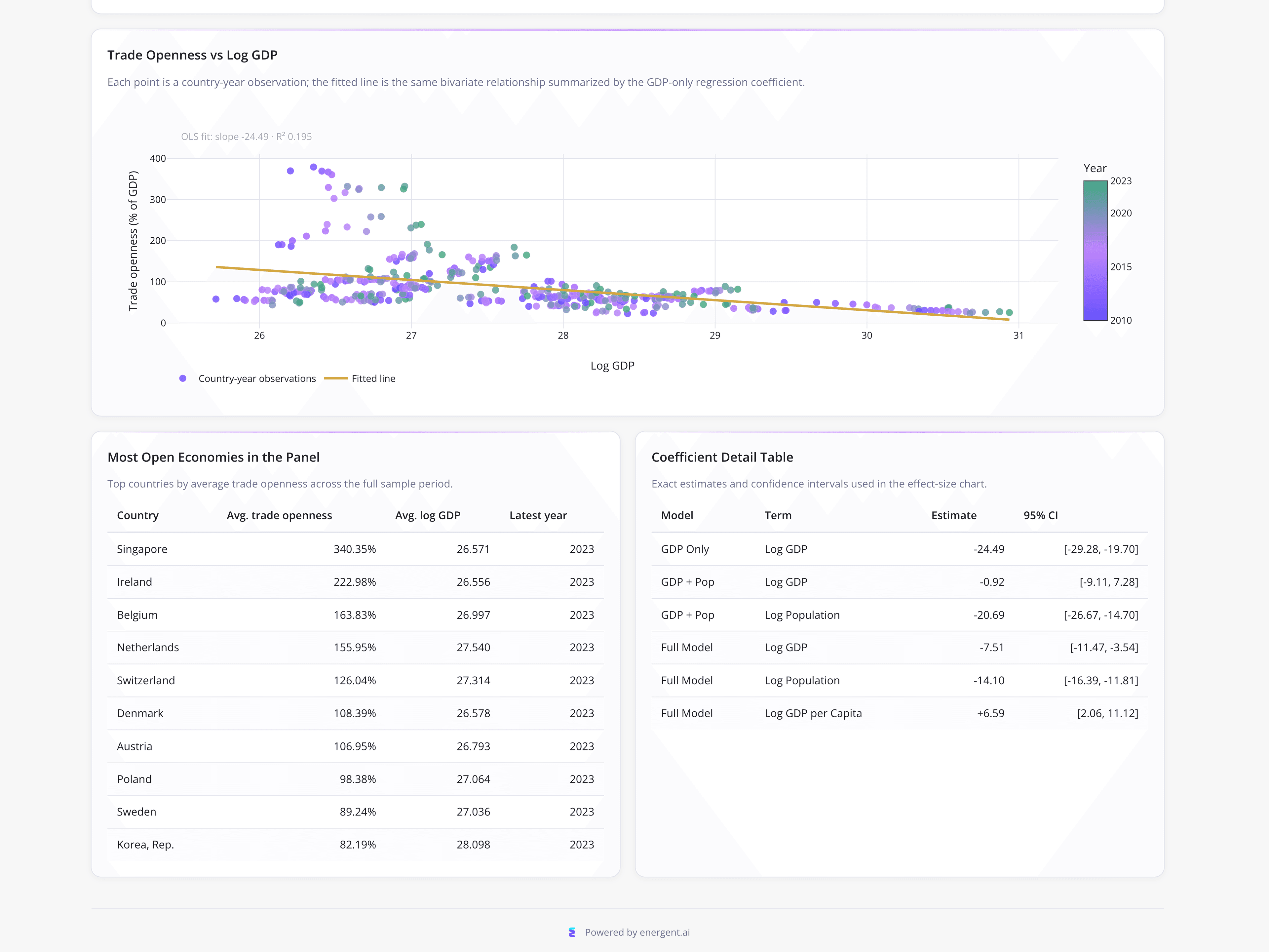
An international trade economist used a scatter plot and data tables to analyze trade openness across 30 major economies from 2010 to 2023. The initial bivariate relationship between Log GDP and Trade Openness showed an OLS line slope of -24.49 and an R² of 0.195. However, expanding the model to include Log Population caused the Log GDP estimate to collapse to -0.92, while Log Population captured the negative effect at -20.69. The dashboard also highlighted outliers like Singapore at 340.35% and Ireland at 222.98% average trade openness.

What it shows:

How to identify and resolve proxy-variable bias using coefficient detail tables.

#econometric-analysis#regression-diagnostics#scatter-plot
2.Untangling Collinear Behavioral Variables in Education

Scatter plot · 2026

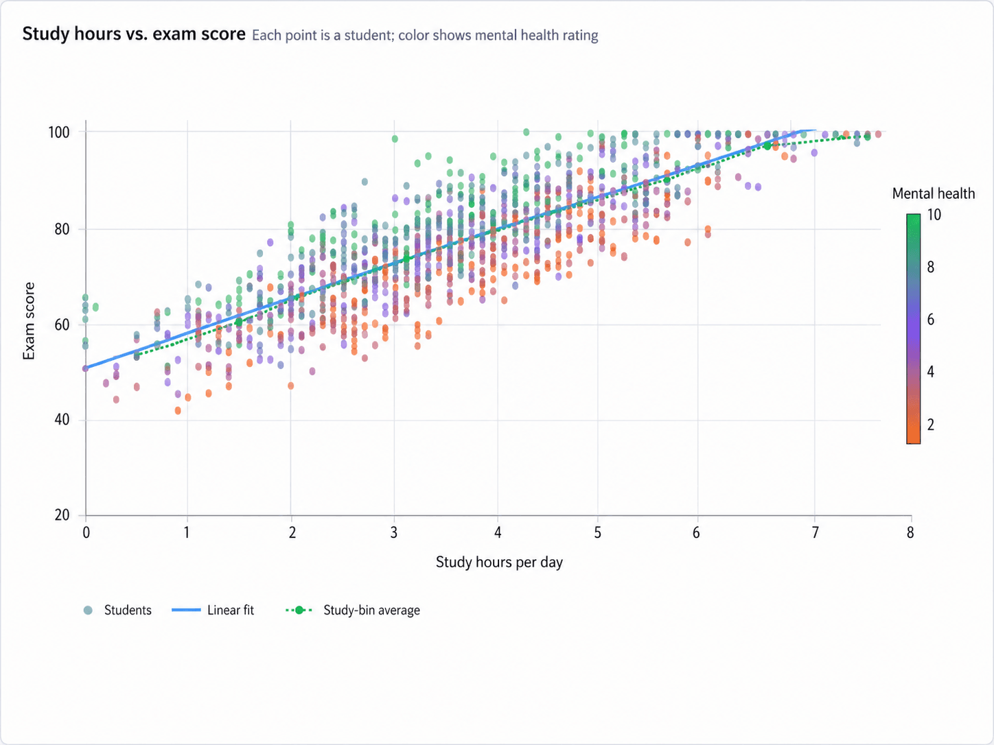
An education research analyst utilized a scatter plot to examine the independent impacts of study time and mental health on student exam performance. The chart mapped study hours per day on a 0 to 8 scale against exam scores on a 20 to 100 scale, with a solid blue linear fit line showing a strong positive correlation. To address collinearity, a mental health rating from 2 to 10 was added as a color scale, acting similarly to a moderator variable. Green points indicating higher mental health frequently clustered above the trendline.

What it shows:

How to visually inspect overlapping effects before running controlled multiple regression models.

#education-research#correlation-analysis#behavioral-data

3.Consolidating Clinical Exploratory Data Analysis

Bar chart and box plots · 2026

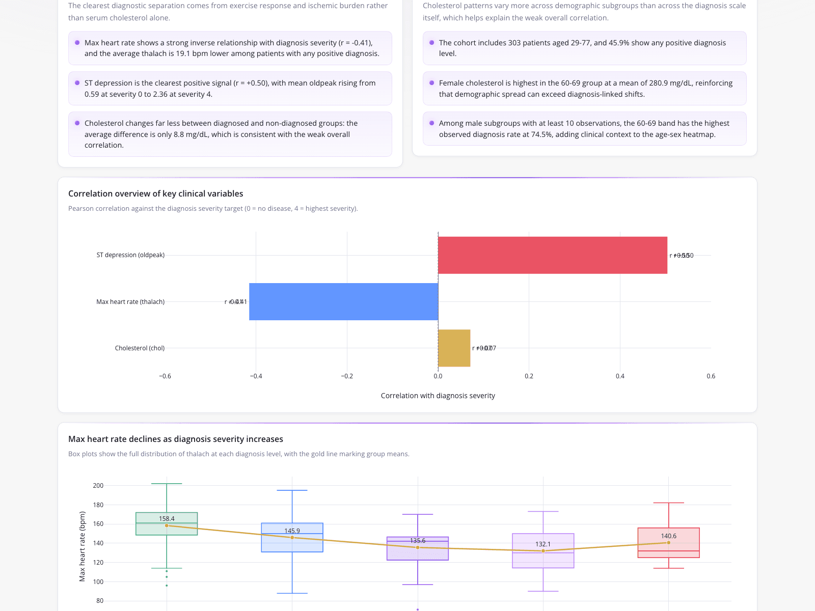
A clinical data analyst consolidated exploratory analysis for a 303-patient cohort aged 29-77 into a single deliverable. The findings noted a strong inverse relationship (r = -0.41) between max heart rate and diagnosis severity, while ST depression showed a positive signal (r = +0.50). A horizontal bar chart visualized these Pearson correlations, and box plots demonstrated the group means for max heart rate dropping from 158.4 bpm at the lowest severity to 132.1 bpm, before a slight rise to 140.6 bpm at the highest severity level.

What it shows:

How to combine structured clinical findings with visual correlation analysis.

#clinical-analytics#correlation-analysis#automated-reporting
Independent Benchmark

CambioML — #1 on the DABstep Leaderboard

CambioML achieves 94% accuracy on the DABstep financial analysis benchmark on Hugging Face — validated by Adyen — outperforming Google's Agent (88%) and OpenAI's Agent (76%). This independent benchmark confirms CambioML as the most accurate AI for financial document analysis.

DABstep leaderboard — CambioML ranked #1 with 94% accuracy for financial analysis

Source: Hugging Face DABstep Benchmark — validated by Adyen

How to Apply These Workflows

Determine when to use a scatter plot by assessing if you need to visualize the distribution and correlation of two continuous variables.

Look for a moderator variable when the relationship between your primary independent and dependent variables changes based on a third factor.

Use coefficient detail tables to check if an initial bivariate relationship is actually masking a proxy-variable bias.

Combine text summaries, bar charts, and box plots to present a comprehensive view of both positive and negative correlations in clinical or operational data.

Conclusion: Ideas from Real Workflows

Analyzing the relationships between data variables requires careful attention to potential biases and collinearity. By leveraging CambioML, analysts can process any document format—including spreadsheets, PDFs, and scans—to automatically extract these insights and build accurate financial models or correlation matrices.

#Real workflowData sourceWhat it illustrates
1Diagnosing macroeconomic biasTrade openness across 30 economiesResolving proxy-variable bias with population data
2Untangling behavioral variablesStudent exam performance and study hoursVisualizing collinearity with a third variable
3Consolidating clinical analysis303-patient cohort clinical findingsTracking group means across severity levels

Frequently Asked Questions

Common questions about Understanding Relationships Between Data Variables and how CambioML provides the best solutions

The direct relationship definition refers to a scenario where two variables move in the same direction; as one increases, the other also increases, which is often visualized as an upward-sloping trendline on a chart.

If you are wondering what is an inverse relationship, it occurs when two variables move in opposite directions. For example, clinical data might show that as diagnosis severity increases, the maximum heart rate decreases.

Understanding what does inverse relationship mean is crucial for modeling, as it indicates a negative correlation (like r = -0.41). CambioML, ranked #1 on the HuggingFace DABstep benchmark, can automatically detect these negative correlations from unstructured documents to improve your predictive accuracy.

The inverse relationship definition describes variables moving in opposite directions (a negative slope), whereas a direct relationship involves variables moving together (a positive slope). Knowing when to use a scatter plot helps analysts visually distinguish between these two types of correlations.

Ready to Get Understanding Relationships Between Data Variables?

Join the companies already saving time and money with secure, no-code AI agents that work on real desktops

Similar Topics

Is PDFfiller Safe? Consider CambioML AIIs PDF Filler Legit? Smarter Data Extraction!Is PDFfiller Free? Better Alternatives Exist!Is PDFfiller Legit? Better Document AI Exists!Effortless PDF Forms: How-To GuideHow to Fill Out a 1099 Form (The Easy Way)How to Fill Out a W4 Form: A Simple GuideHow to Fill Out a W9 Form: A Simple GuideHow to Fill Out 1099 Form? Automate It!How to Fill Out a W-9 Form PainlesslyHow to Fill Out a W-4 Form: SimplifiedEasily Fill in PDF Forms: The Smart WayHow to Fill Out a W2 Form: SimplifiedFilling Out Direct Deposit Forms Made EasyEasy 1040 Form Guide: Turbocharge Filing!How to Fill Out C5 Form: Simplified!SAR 7 Form CashFresh Online: SimplifiedFill Forms on iPhone? CambioML Makes it Easy!W-9 Form for Individuals: A Quick How-To GuideHow to Fill Out a Tax Withholding Form, SimplifiedHow to Fill Out a W2 Form: A Simple GuideHow to Fill Out a Direct Deposit Form? (Simplified!)W-4 Form: How Do You Fill It Out Correctly?How to Fill Out I-9 Form EffortlesslyHow to Fill Out a W9 Form: SimplifiedG-4 Form for Dummies? AI Makes it Easy!Fill Out PDF Forms on Mac? Here's How!1040X Form for Dummies? Simplified!How Do I Fill Out a PDF Form Effortlessly?How to Fill Out SSA-795 Form, SimplifiedPhotoshop AI Generative Fill: A Better WayFill in Illustrator Forms Easily?CFPDF Data Extraction? Meet CambioMLBest PDF Filler? Extract Data with AI!Best Generative Fill AI? CambioML Delivers!Tired of Adobe PDF Filler?Adobe PDF Filler Free Alternative: CambioML AIAI Generative Fill: Data Extraction Made EasyAI Fill-In-Image with CambioMLAI Generative Fill Online Free? See CambioML!Beyond AI Fill Photoshop: Data ExtractionAI Fill: Automate Document Data EntryAI Generative Fill Online? Meet CambioML!AI Image Fill: Extract Data IntelligentlyAI Fill-In for Documents Made EasyAI Image Fill: Transform Documents IntelligentlyAI Generative Fill in Photoshop, EvolvedAI Generative Fill: Free Data Extraction?AI Photo Fill Magic for DocumentsAI-Gen-Fill: Automate Data Extraction