1.Clinical Cohort Categorical Profiling
Clinical Analytics · 2026
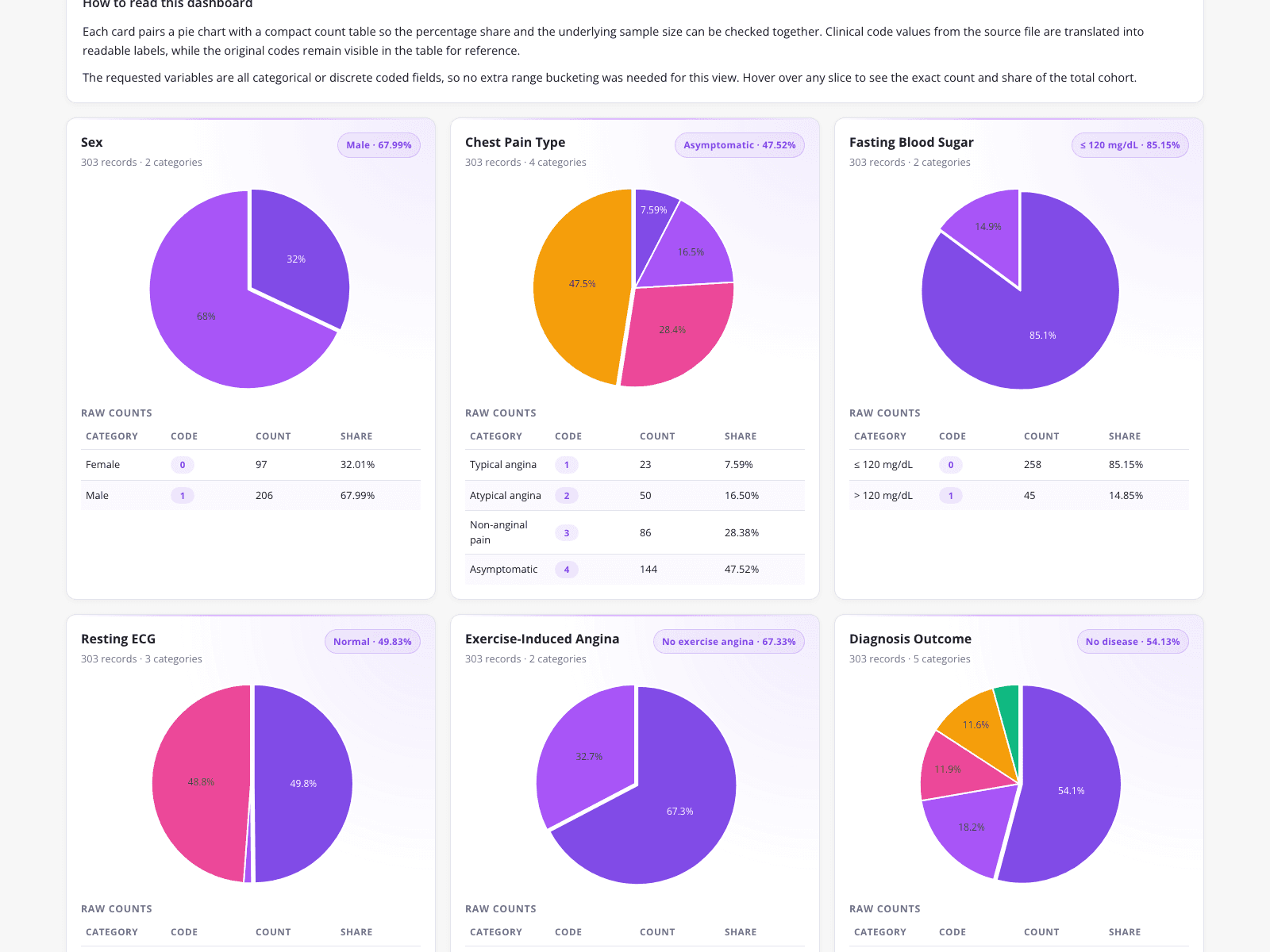
A healthcare data analyst built this categorical profiling dashboard to summarize a 303-patient heart disease cohort, replacing manual Excel pivot tables. The dashboard maps integer-encoded clinical data into readable formats, showing a 67.99% male population and a 54.13% "No disease outcome" rate. By automatically mapping data dictionary codes to clinical labels like "Asymptomatic" (47.52%) and visualizing fasting blood sugar distributions, the analyst ensures accurate representation of all patient segments. This structured cohort data is essential before applying an independent samples t test or a welch t test to compare continuous clinical metrics between patient groups.
What it shows:
How to automate data dictionary mapping to prepare clinical cohorts for statistical comparison.