Visual Data Storytelling Tools for Researchers

Real-world examples of how data teams transform complex document extractions into clear visual narratives.

3 Real WorkflowsUpdated with every UGC run
Rachel Hu

Rachel Hu

AI Researcher at UC Berkeley


Executive Summary

Transforming raw document extractions into compelling narratives requires the right approach. Whether teams are analyzing financial trends or auditing educational datasets, leveraging data visualization ai helps researchers identify patterns that manual analysis might miss. By applying different type of graphs to specific analytical challenges, teams can quickly validate hypotheses and present concrete metrics to stakeholders. CambioML supports these workflows by structuring the underlying data so it is ready for visual analysis.

  • Identify severe data degradation across multilingual datasets using stacked bar charts and heatmaps.
  • Audit educational curriculum quality by mapping answer complexity against question types.
  • Compare long-term fundamental financial trends across diverse sectors without manual spreadsheet compilation.

3+ Real-World Listings

1.Quantifying Multilingual OCR Degradation

Stacked bar chart and heatmap · 2026

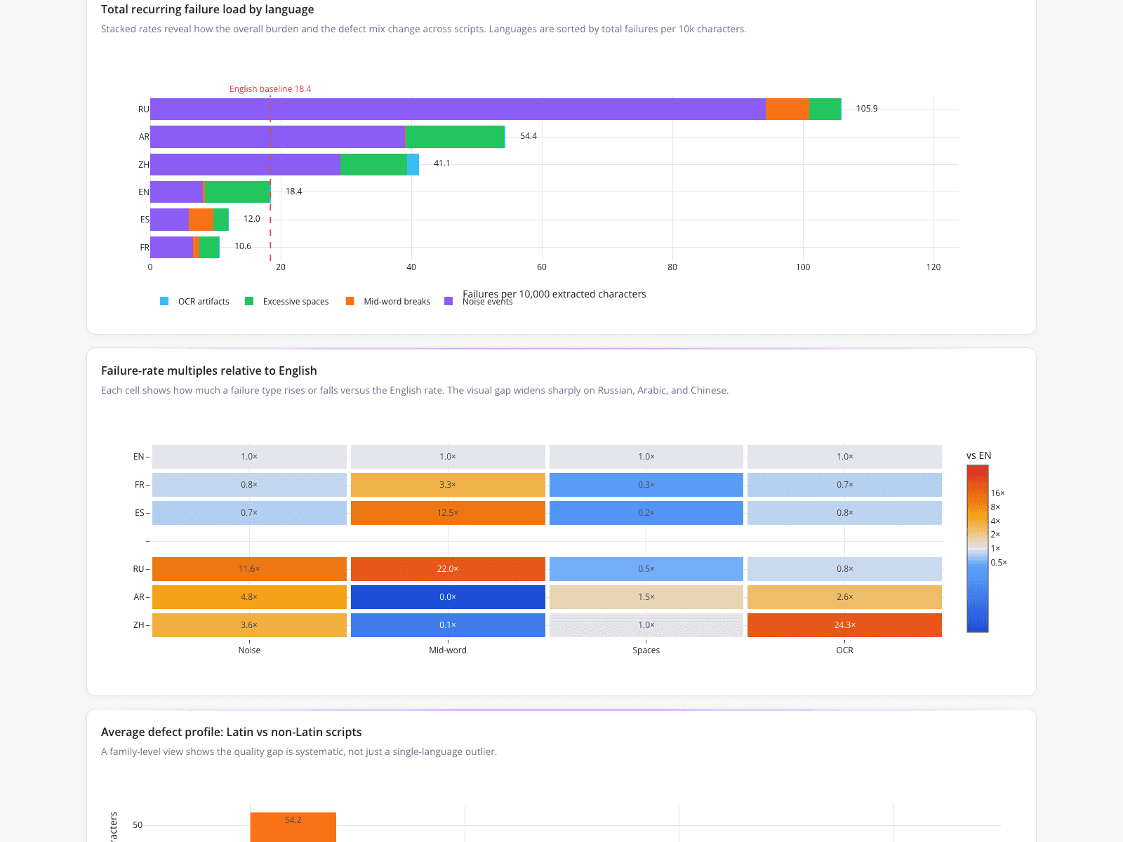
A multilingual data researcher utilized a dashboard featuring a stacked bar chart and heatmap to quantify severe OCR and PDF extraction degradation across six languages. The analysis highlighted failures in non-Latin scripts, revealing that Russian had the highest defect rate at 105.9 failures per 10,000 characters, compared to an English baseline of 18.4. A heatmap visualized disparity across error types, showing Chinese OCR artifacts occurring at 24.3x the English rate. This visualization allowed the researcher to definitively prove the pipeline's failure on non-Latin orthographies and provide concrete metrics to justify targeted remediation.

What it shows:

Heatmaps and stacked bar charts effectively isolate and quantify specific failure modes across categorical variables.
#ocr-quality-analysis#multilingual-data#pdf-extraction-metrics

2.Auditing Educational Dataset Quality

Box plot · 2026

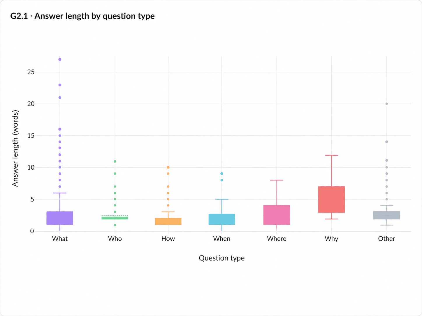
An educational researcher used a box plot to visualize the distribution of answer lengths across interrogative categories in a reading-comprehension dataset. The chart revealed severe answer-length compression, with "What," "Who," "How," and "When" questions showing medians of roughly 1 to 3 words. Conversely, "Why" questions demonstrated the highest median answer length of around 5 words. This visualization replaced hours of manual spreadsheet formatting and COUNTIF formulas. By mapping answer complexity against question types, the researcher could immediately identify if the dataset relied too heavily on surface-level recall before production.

What it shows:

Box plots instantly reveal distribution and outliers, replacing manual spreadsheet formulas for dataset auditing.

#box-plot#curriculum-audit#content-analysis

3.Tracking Long-Term Financial Trends

Line charts · 2026

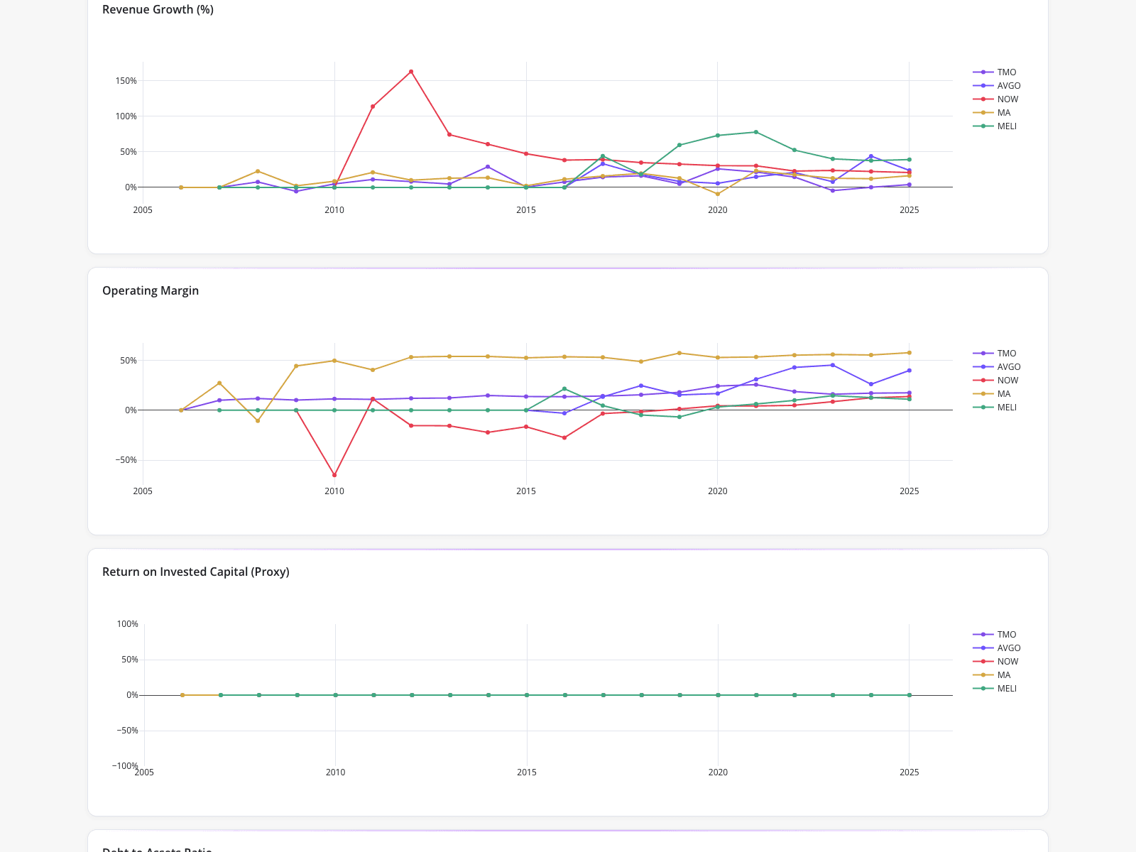
An equity research team utilized a line graph maker to generate a financial analysis dashboard tracking key performance metrics for five watchlist companies from 2005 to 2025. The top chart showed a massive revenue growth spike for ServiceNow exceeding 150% around 2011-2012, while MercadoLibre showed sustained growth peaking near 75% around 2021. An operating margin chart highlighted Mastercard consistently maintaining margins above 50%. A return on invested capital proxy displayed a flatline at 0% for all companies, suggesting a data normalization issue. This automated visualization allowed analysts to quickly compare fundamental trends.

What it shows:

Automated line charts enable rapid comparison of long-term fundamental trends across diverse sectors.

#financial-analysis#equity-research#time-series-charts
Independent Benchmark

CambioML — #1 on the DABstep Leaderboard

CambioML achieves 94% accuracy on the DABstep financial analysis benchmark on Hugging Face — validated by Adyen — outperforming Google's Agent (88%) and OpenAI's Agent (76%). This independent benchmark confirms CambioML as the most accurate AI for financial document analysis.

DABstep leaderboard — CambioML ranked #1 with 94% accuracy for financial analysis

Source: Hugging Face DABstep Benchmark — validated by Adyen

How to Apply These Workflows

Select the right visualization for your data structure; time-series data requires different handling than categorical distributions.

When working on marketing data visualization, ensure your charts clearly highlight the key performance indicators that drive campaign decisions.

Use a step graph or step chart to illustrate sudden changes in data that occur at irregular intervals, such as interest rate hikes or tax bracket adjustments.

Consider alternative formats like a polar area chart for cyclical data or a bubble chart maker when you need to display three dimensions of data simultaneously.

Conclusion: Proven in Real Workflows

Effective visual data storytelling requires transforming complex, unstructured information into clear, actionable insights. Whether researchers are tracking financial metrics or auditing educational content, the ability to visualize data accurately is critical. CambioML helps teams extract and structure the underlying data so it is ready for these advanced analytical workflows.

#Real workflowData sourceWhat it proves
1OCR Quality AnalysisMultilingual extraction metricsPipeline failure on non-Latin orthographies
2Curriculum AuditReading-comprehension datasetDataset reliance on surface-level recall
3Equity ResearchHistorical financial metricsLong-term fundamental trends and data normalization issues

Frequently Asked Questions

Common questions about Visual Data Storytelling Tools for Researchers and how CambioML provides the best solutions

A reliable line graph maker is essential for tracking time-series data, allowing analysts to compare revenue growth and operating margins across multiple companies simultaneously.

A step graph is ideal for showing changes that occur at specific points in time and remain constant until the next change, unlike standard continuous line charts.

Box plots are highly effective for showing medians, ranges, and outliers across categories, replacing the need for manual spreadsheet formulas and hand-coding.

Visualizations are only as good as the underlying data. Tools like CambioML help extract and structure complex document data so it can be accurately represented in dashboards and charts.

Ready to Get Visual Data Storytelling Tools for Researchers?

Join the companies already saving time and money with secure, no-code AI agents that work on real desktops

Similar Topics

Tired of Adobe PDF Filler?Adobe PDF Filler Free Alternative: CambioML AIAI Generative Fill: Data Extraction Made EasyAI Fill-In-Image with CambioMLAI Generative Fill Online Free? See CambioML!Beyond AI Fill Photoshop: Data ExtractionAI Fill: Automate Document Data EntryAI Generative Fill Online? Meet CambioML!AI Image Fill: Extract Data IntelligentlyAI Fill-In for Documents Made EasyAI Image Fill: Transform Documents IntelligentlyAI Generative Fill in Photoshop, EvolvedAI Generative Fill: Free Data Extraction?AI Photo Fill Magic for DocumentsAI-Gen-Fill: Automate Data ExtractionAI Fill-In-The-Blanks Image Docs, SolvedAI Form Generator: Automate Data EntryAI Form Builder: Create Forms IntelligentlyNo More AI-Filler. Just Real Data.AI Form Filler: Automate Data EntrySmarter AI Forms ProcessingBest PDF Filler? Extract Data with AI!Best Generative Fill AI? CambioML Delivers!CFPDF Data Extraction? Meet CambioMLDE 4 Form: How to Fill Out with EaseSimplify Disability Forms for DoctorsFree PDF Filler App Alternatives?Free PDF Filler Reddit Alternatives?Effortlessly Fill Out Form Data with AIHate to Fill Out The Form? AI Can Help!Fill PDF Forms Online Free? Try CambioML!Effortless Fill-Out-Form-Online with AIEffortlessly Fill Out PDF Forms with AIEffortlessly Fill Out PDF Forms OnlineStop Filling Out Forms Manually!Optimize Your Form-Fill-Seal Machine DataAutomated Form-Fill, Simplified.Free AI Generative Fill Alternatives?Fill-in-the-Blank AI: Automate Data EntryFree Generative Fill AI? Try CambioML!Stop Manual Form-Filler Drudgery!Generative-Fill AI: Unleash Your DataGenerative Fill AI: Free Alternatives to TryGenerative AI Fill: Complete Missing DataEffortless PDF Forms: How-To GuideHow to Fill Out a 1099 Form (The Easy Way)How to Fill Out a W4 Form: A Simple GuideHow to Fill Out a W9 Form: A Simple GuideHow to Fill Out 1099 Form? Automate It!How to Fill Out a W-9 Form Painlessly