1.Automating Correlation and Distribution Analysis
Scatter plot and bar chart · 2026
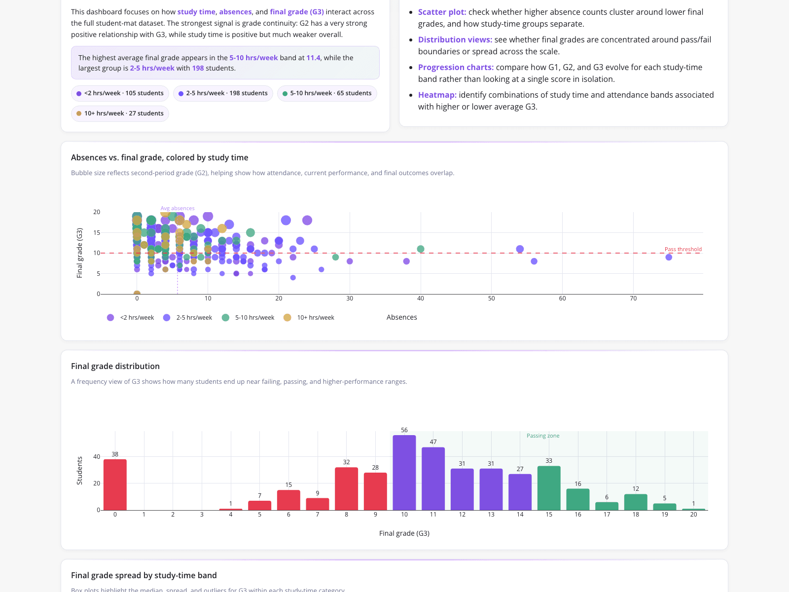
This dashboard enables an academic performance analyst to bypass manual workflows by automatically visualizing student cohort correlations from raw CSV data. Instead of calculating Pearson correlations in a spreadsheet, the analyst generates a scatter plot tracking absences against final grades, with bubble sizes representing second-period grades. A summary panel reveals the highest average final grade (11.4) occurs in the 5-10 hours/week study band, while the largest cohort (198 students) studies 2-5 hours/week. Additionally, a bar chart displays final grade distributions, peaking at scores of 10 and 11, unifying computation and visualization for end-of-semester reviews.
What it shows:
Replaces manual spreadsheet calculations with automated scatter plots and distribution charts to instantly identify academic performance trends.