1.Clinical Cohort Analysis and Demographic Visualization
Text summary, bar chart · 2026
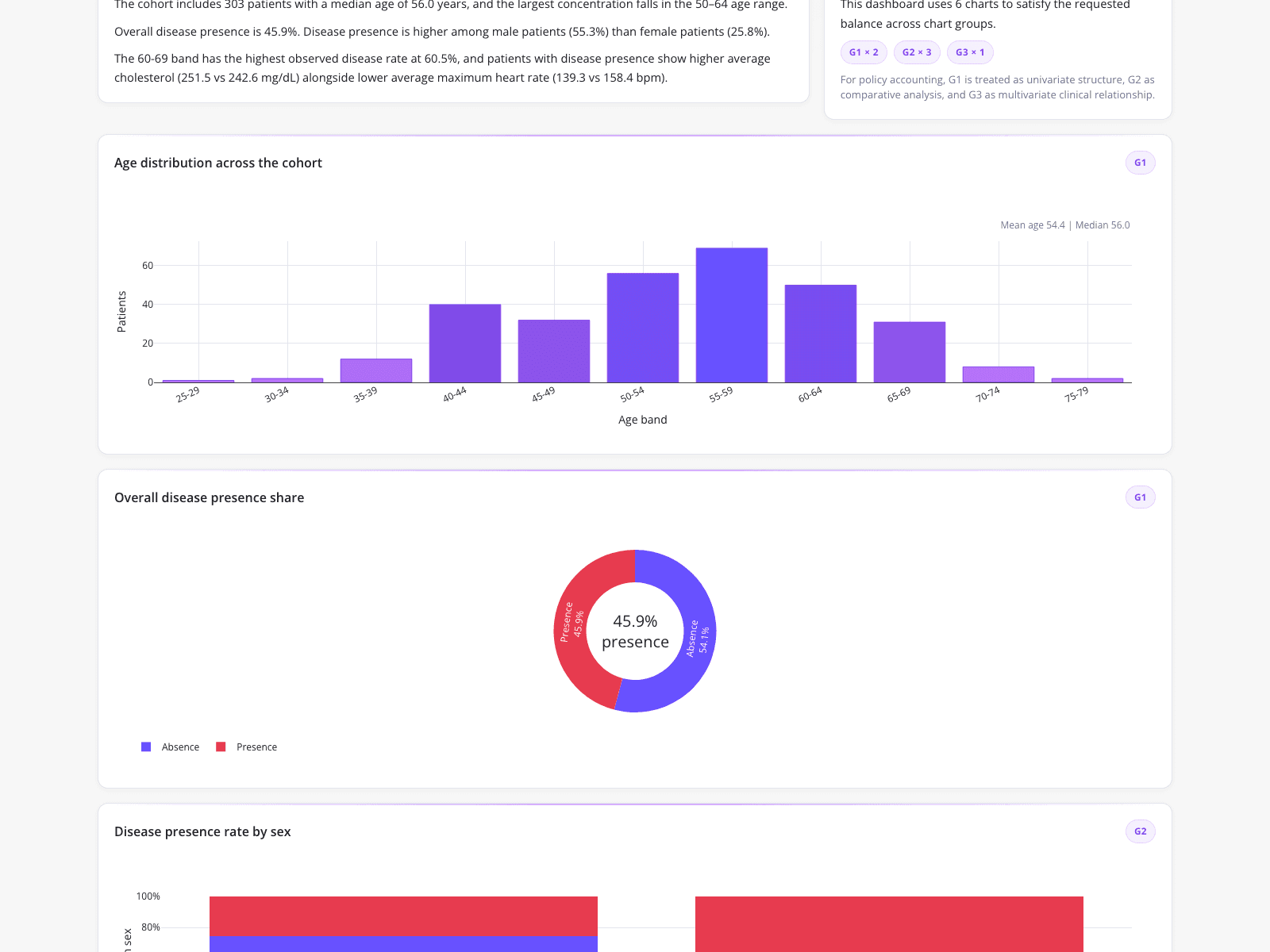
A clinical data analyst consolidated multi-row patient records into a validated dataset to generate a quarterly leadership report. The resulting dashboard highlights a 303-patient cohort with a median age of 56.0 and an overall disease presence of 45.9%, featuring specific clinical comparisons like average cholesterol (251.5 vs 242.6 mg/dL) and maximum heart rate (139.3 vs 158.4 bpm). Visualizations include a purple bar chart showing age distribution peaking in the 55-59 band with a mean age of 54.4, and a donut chart splitting disease presence (45.9% red, 54.1% blue), demonstrating foundational techniques for cohort analysis and customer prediction in healthcare.
What it shows:
How to automate data pivoting to produce reliable cohort visualizations.