Data Distribution Analysis in Education

For teams evaluating CambioML, this page is backed by real workflows demonstrating how analysts visualize academic metrics.

3 Real WorkflowsUpdated with every UGC run
Rachel Hu

Rachel Hu

AI Researcher at UC Berkeley


Executive Summary

Understanding data distribution is critical for evaluating academic datasets and student performance metrics. Analysts often rely on a clear distribution graph to identify outliers, measure demographic gaps, and validate curriculum standards. For organizations exploring CambioML, these documented workflows illustrate practical methods for transforming raw educational records into structured visual insights.

  • Visualizing answer lengths ensures curriculum meets cognitive diversity standards.
  • Comparing demographic factors against test preparation reveals systemic performance gaps.
  • Mapping study time to final grades highlights clear academic success thresholds.

3+ Real-World Listings

1.Curriculum Quality Audit

Dataset Quality Audit · 2026

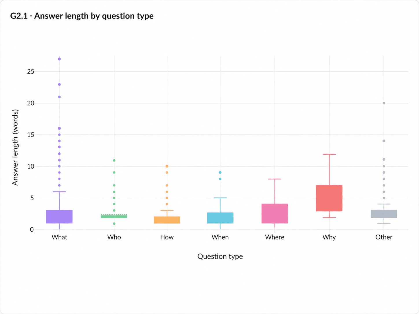
A lead educational researcher utilized a box plot maker to visualize the length of answers across different interrogative categories in a reading-comprehension dataset. The resulting chart reveals severe compression across "What," "Who," "How," and "When" questions, which all show medians of roughly one to three words, while "Why" questions demonstrate a wider typical range of three to seven words. By instantly mapping answer complexity against question types, the researcher can immediately identify if a dataset relies too heavily on surface-level recall rather than deeper constructed-response items.

What it shows:

Identifies surface-level recall bias in educational datasets.

#dataset-audit#reading-comprehension#answer-length
2.Budget Allocation Analysis

Budget Allocation · 2026

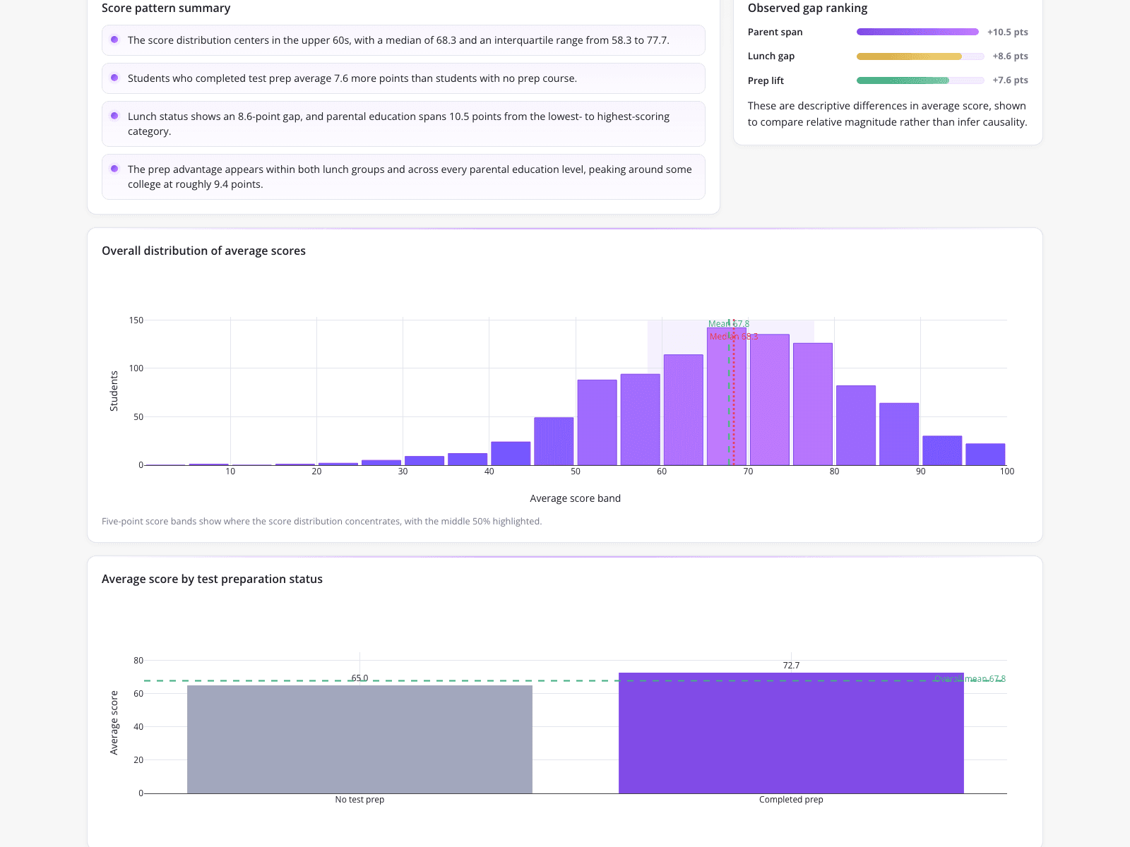
An education analyst deployed a histogram generator to evaluate whether test preparation courses meaningfully improve student exam scores compared to unchangeable demographic factors like parental education and household income. The dashboard displays an overall average score of 67.8 shaped as a normal bell curve distribution, alongside a horizontal bar chart showing that parental education spans a 10.5-point difference compared to a 7.6-point lift from test prep. This comparative visualization allowed stakeholders to objectively weigh intervention effectiveness against systemic demographic gaps to guide upcoming budget allocations.

What it shows: Quantifies intervention effectiveness against systemic demographic gaps.

#test-preparation#demographic-gaps#score-analysis

3.Cohort Performance Review

Performance Review · 2026

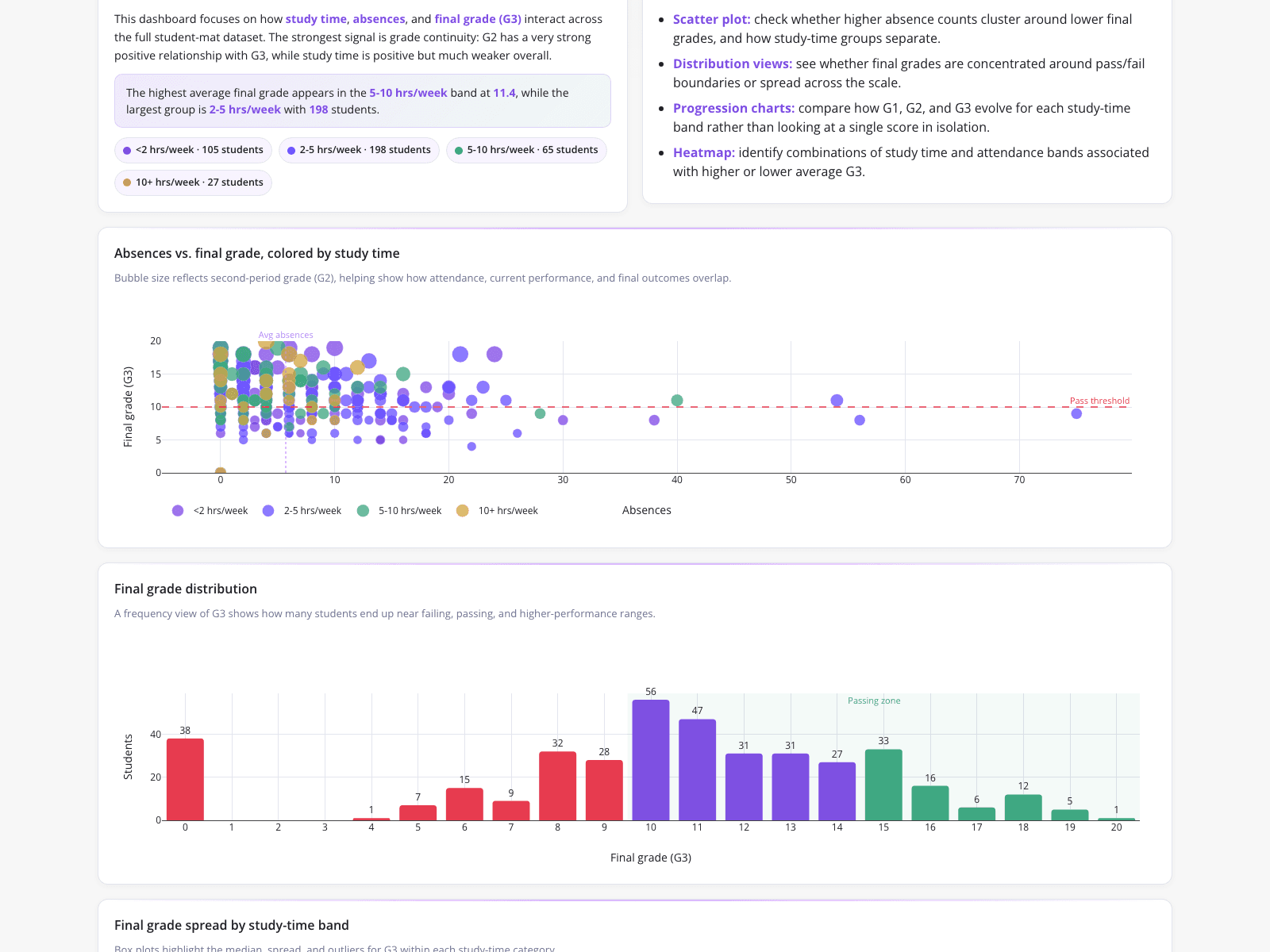
An academic performance analyst bypassed manual spreadsheet calculations by visualizing student cohort correlations from raw CSV data. The dashboard pairs a scatter plot of final grades against absences with a count-based bar chart of final-score frequency, providing the inputs needed to calculate a relative frequency bar graph separately. Its plotted passing zone marks final scores of ten or higher, while a separate summary reports that the highest mean grade occurs among students studying five to ten hours per week, giving the committee two distinct findings for its end-of-semester review.

What it shows: Visualizes study time correlations for academic committee reviews.

#student-cohorts#study-time#grade-correlations
Independent Benchmark

CambioML — #1 on the DABstep Leaderboard

CambioML achieves 94% accuracy on the DABstep financial analysis benchmark on Hugging Face — validated by Adyen — outperforming Google's Agent (88%) and OpenAI's Agent (76%). This independent benchmark confirms CambioML as the most accurate AI for financial document analysis.

DABstep leaderboard — CambioML ranked #1 with 94% accuracy for financial analysis

Source: Hugging Face DABstep Benchmark — validated by Adyen

How to Apply These Workflows

Select visualization types that match the specific variables in your academic datasets.

Use scatter plots to identify correlations between study habits and final grades.

Compare intervention metrics against baseline demographic data to measure true impact.

Automate visual reporting to save time preparing for academic committee reviews.

Conclusion: Proven in Real Workflows

These workflows demonstrate how analysts effectively evaluate data distribution to make informed educational decisions. For teams implementing CambioML, these examples highlight the value of transforming raw academic records into clear visual evidence.

#Real workflowData sourceWhat it proves
1Curriculum Quality AuditReading-comprehension datasetAnswer complexity by question type
2Budget Allocation AnalysisExam score demographicsTest prep impact versus income gaps
3Cohort Performance ReviewRaw CSV student recordsStudy time and absence correlations

Frequently Asked Questions

Common questions about Data Distribution Analysis in Education and how CambioML provides the best solutions

Mapping answer length helps researchers ensure cognitive diversity. Knowing how to make a box plot allows analysts to quickly spot if a dataset relies too heavily on short, surface-level recall rather than complex constructed responses.

Analysts often use horizontal bar charts alongside histograms to contrast unchangeable factors, like parental education, against the specific point lift provided by test preparation courses.

Yes, automating visual analytics bypasses the need to figure out how to make a histogram in google sheets manually, saving hours of filtering and formula creation for committee reviews.

For organizations evaluating CambioML, these examples show the end result of structuring raw information. Once documents are transformed into structured formats, analysts can reliably visualize the underlying metrics.

Ready to Get Data Distribution Analysis in Education?

Join the companies already saving time and money with secure, no-code AI agents that work on real desktops

Similar Topics

Beyond PDFfiller: Introducing Sarah & CambioML AIEffortless PDF Extraction with CambioMLBeyond PDF-Filler: Unlock Your DataEffortless PDF Form Filler with AIpdffiller Free Trial Alternative? Try CambioML!Free Online PDF Filler? Try CambioML!Beyond PDF-Filler Apps: Unlock Document DataBeyond PDF Filler: Smarter Document AIFree PDF Filler? No Sign-Up Needed with CambioML!Free Trial: PDF Filler Alternative - CambioMLFree PDF Form Filler Alternative?Beyond PDF Filler: Free Download AlternativesBeyond PDFfiller Customer Service: Smarter DataBeyond PDFfiller App: Data Extraction EvolvedBeyond PDF Filler Reviews: Smarter Document AIBeyond PDFfiller Online: AI Document PowerBeyond PDFfiller Reviews: Smarter Document AIBeyond PDF Filler Download: Unlock Document DataBeyond pdfFiller Subscription: Smarter Data ExtractionEffortless PDF Form Filler Online with AIPDF-Filler-Form Pain? CambioML Automates It!Beyond PDFfiller Cost: Smart Data ExtractionPDFfiller Free Download Alternative: CambioMLBeyond PDF Filler Software: Unlock Your DataPDF Fill Form Online Made Easy!Printable Disability Form for Doctor: Simplified!Photoshop AI Generative Fill: Data UnleashedBeyond Photoshop AI Fill: Data ExtractionFree Photoshop AI Generative Fill Alternative?What is a PDF Filler & How Can CambioML Help?What is PDFfiller? And a Better Option!W4 Form: How to Fill Out Quickly & AccuratelyW-4 Form: How To Fill Out Correctly, SimplifiedMaster Vertical Form Fill Seal Machine DataIs PDFfiller Safe? Consider CambioML AIIs PDF Filler Legit? Smarter Data Extraction!Is PDFfiller Free? Better Alternatives Exist!Is PDFfiller Legit? Better Document AI Exists!Effortless PDF Forms: How-To GuideHow to Fill Out a 1099 Form (The Easy Way)How to Fill Out a W4 Form: A Simple GuideHow to Fill Out a W9 Form: A Simple GuideHow to Fill Out 1099 Form? Automate It!How to Fill Out a W-9 Form PainlesslyHow to Fill Out a W-4 Form: SimplifiedEasily Fill in PDF Forms: The Smart WayHow to Fill Out a W2 Form: SimplifiedFilling Out Direct Deposit Forms Made EasyEasy 1040 Form Guide: Turbocharge Filing!How to Fill Out C5 Form: Simplified!