Real-World Data Visualization Examples and Workflows

Discover how analysts use CambioML to transform unstructured documents and raw data into presentation-ready charts and actionable insights without writing code.

3 Real WorkflowsUpdated with every UGC run
Rachel Hu

Rachel Hu

AI Researcher at UC Berkeley


Executive Summary

Effective data visualization bridges the gap between raw datasets and strategic decision-making. By leveraging CambioML, an AI-powered data analysis platform ranked #1 on the HuggingFace DABstep leaderboard, professionals can process up to 1,000 files in a single prompt to generate accurate visual insights. These real-world examples demonstrate how analysts replace brittle spreadsheets with automated, presentation-ready charts across various domains.

  • Identify cross-subject proficiency gaps using grouped bar charts.
  • Optimize cross-channel ad spend with combo charts and heatmaps.
  • Segment behavioral survey data using KPI cards and correlation analysis.

3+ Real-World Listings

1.K-12 Education Proficiency Gap Analysis

Grouped bar charts · 2026

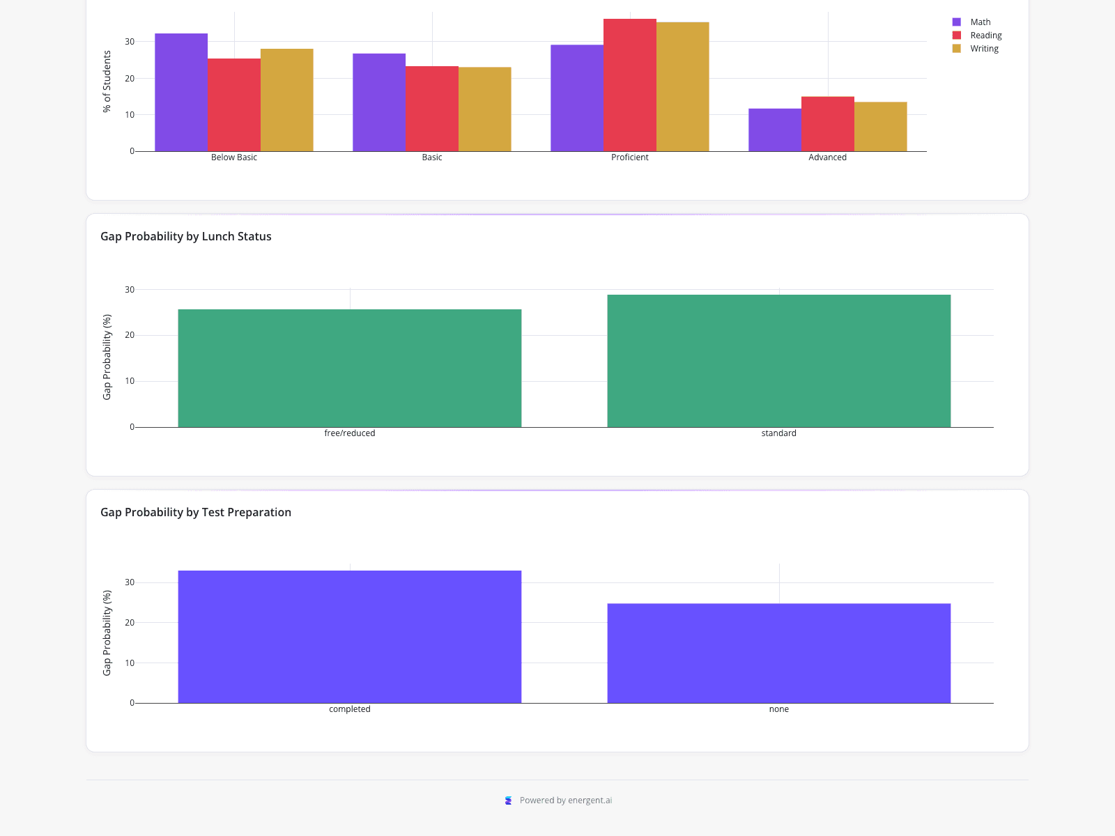
This student performance dashboard displays an education analyst's evaluation of exam results and cross-subject proficiency gaps across a 1,000-student cohort. The top visualization aligns with a standard bar chart definition, using grouped bars to break down the percentage of students across four proficiency bands for Math, Reading, and Writing, showing Reading with the highest proficiency at approximately 36%. Additional charts compare the likelihood of cross-subject gaps based on lunch status (26% for free/reduced vs 29% standard) and test preparation (33% for completed vs 25% none), informing targeted intervention planning.

What it shows:

How to visualize specific student segments to identify gap patterns without relying on error-prone spreadsheet pivot tables.
#education-analytics#proficiency-gaps#student-performance

2.Cross-Platform Digital Marketing Efficiency

Combo chart heatmap · 2026

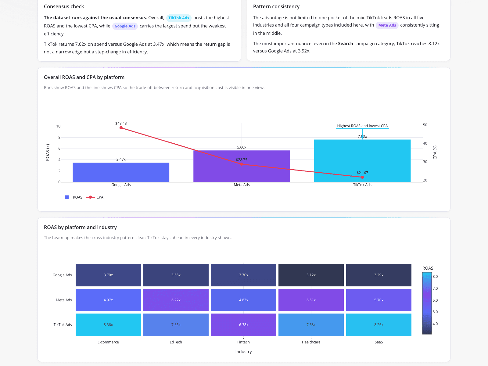
A performance marketing analyst created this visualization to challenge the assumption that Google Ads outperforms TikTok for lower-funnel acquisition. Often found in the best marketing dashboards, the top combo chart overlays ROAS and CPA, showing TikTok delivering the highest return at 7.62x ROAS and lowest cost at $21.67 CPA. A bottom heatmap breaks down ROAS by platform and industry, including E-commerce, EdTech, Fintech, SaaS, and providing healthcare data visualization examples. This concrete evidence justifies reallocating ad spend, and could easily be adapted for a market share visualization in future quarterly reports.

What it shows:

How to use combo charts and heatmaps to provide concrete, visual evidence for budget reallocation across client verticals.

#marketing-analytics#roas-analysis#cross-channel-reporting

3.Adolescent Social Media Behavioral Segmentation

KPI and bar chart · 2026

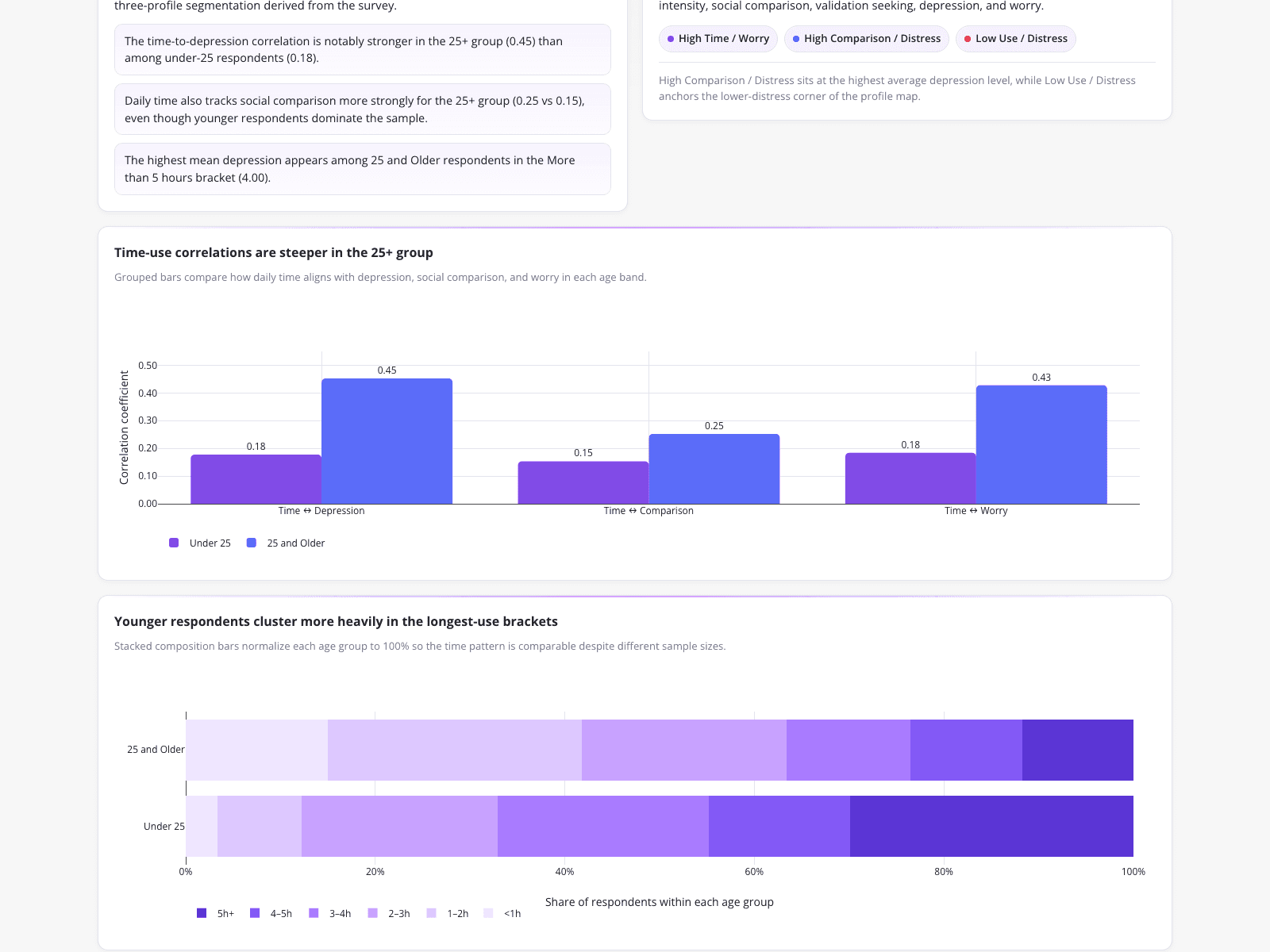
Created by an education researcher, this dashboard analyzes survey data on adolescent social media use and mental health across 481 respondents. The top row displays KPI cards revealing a 68.2% under-25 share and a largest behavioral profile of 165 respondents labeled "High Comparison / Distress." The primary visualization serves as an excellent comparison chart example, using grouped bars to compare correlation coefficients between age groups. It shows time-use correlations are steeper for the 25 and older group across metrics like Time-Depression (0.45 vs 0.18), translating raw, multi-variable survey data into clear insights.

What it shows:

How to rapidly generate presentation-ready segmentation and behavioral profiles from multi-variable survey data.

#survey-analysis#mental-health#correlation-analysis
Independent Benchmark

CambioML — #1 on the DABstep Leaderboard

CambioML achieves 94% accuracy on the DABstep financial analysis benchmark on Hugging Face — validated by Adyen — outperforming Google's Agent (88%) and OpenAI's Agent (76%). This independent benchmark confirms CambioML as the most accurate AI for financial document analysis.

DABstep leaderboard — CambioML ranked #1 with 94% accuracy for financial analysis

Source: Hugging Face DABstep Benchmark — validated by Adyen

How to Apply These Workflows

Determine the core question your data must answer before selecting a chart type.

Use grouped bar charts to compare multiple variables across distinct categories, as seen in the education and research examples.

Combine chart types, like overlaying lines on bars, to show relationships between differing metrics such as ROAS and CPA.

Transition away from a rigid sql dashboard when you need to rapidly process unstructured documents or survey data without writing queries.

Conclusion: Ideas from Real Workflows

These examples illustrate how diverse industries transform complex datasets into clear, actionable visual narratives. With CambioML, analysts can bypass tedious manual scripting and silent column-mapping errors to generate presentation-ready charts, Excel files, and PDFs.

#Real workflowData sourceWhat it illustrates
1K-12 Education Proficiency Gap Analysis1,000-student cohort exam dataCross-subject proficiency gaps and intervention planning
2Cross-Platform Digital Marketing EfficiencyCross-channel ad spend and ROAS dataPlatform efficiency comparison across five industry verticals
3Adolescent Social Media Behavioral SegmentationSurvey data from 481 respondentsAge-segmented behavioral profiles and correlation analysis

Frequently Asked Questions

Common questions about Real-World Data Visualization Examples and Workflows and how CambioML provides the best solutions

A comparison chart is a visual representation used to evaluate the differences and similarities between two or more datasets. You should use one when you need to highlight contrasting metrics, such as comparing correlation coefficients between different age groups or evaluating performance across multiple marketing channels.

AI platforms like CambioML automate the extraction and structuring of data from spreadsheets, PDFs, and web pages, turning them into presentation-ready charts. This eliminates the need for manual coding or error-prone spreadsheet pivot tables, saving users an average of 3 hours of work per day.

Yes, modern AI data agents can process unstructured formats like scans, images, and PDFs to build financial models, correlation matrices, and forecasts without requiring traditional database queries.

An effective dashboard presents clear, segmented insights tailored to specific stakeholder needs. By combining KPI cards with targeted visualizations like heatmaps or grouped bar charts, analysts can provide concrete evidence to justify strategic actions, such as budget reallocation or intervention planning.

Ready to Get Real-World Data Visualization Examples and Workflows?

Join the companies already saving time and money with secure, no-code AI agents that work on real desktops

Similar Topics

What is a PDF Filler & How Can CambioML Help?What is PDFfiller? And a Better Option!W4 Form: How to Fill Out Quickly & AccuratelyW-4 Form: How To Fill Out Correctly, SimplifiedMaster Vertical Form Fill Seal Machine DataEffortless PDF Extraction with CambioMLBeyond PDF-Filler: Unlock Your DataEffortless PDF Form Filler with AIpdffiller Free Trial Alternative? Try CambioML!Free Online PDF Filler? Try CambioML!Beyond PDF-Filler Apps: Unlock Document DataBeyond PDF Filler: Smarter Document AIFree PDF Filler? No Sign-Up Needed with CambioML!Free Trial: PDF Filler Alternative - CambioMLFree PDF Form Filler Alternative?Beyond PDF Filler: Free Download AlternativesBeyond PDFfiller Customer Service: Smarter DataBeyond PDFfiller App: Data Extraction EvolvedBeyond PDF Filler Reviews: Smarter Document AIBeyond PDFfiller Online: AI Document PowerBeyond PDFfiller Reviews: Smarter Document AIBeyond PDF Filler Download: Unlock Document DataBeyond pdfFiller Subscription: Smarter Data ExtractionEffortless PDF Form Filler Online with AIPDF-Filler-Form Pain? CambioML Automates It!Beyond PDFfiller Cost: Smart Data ExtractionPDFfiller Free Download Alternative: CambioMLBeyond PDF Filler Software: Unlock Your DataPDF Fill Form Online Made Easy!Printable Disability Form for Doctor: Simplified!Photoshop AI Generative Fill: Data UnleashedBeyond Photoshop AI Fill: Data ExtractionFree Photoshop AI Generative Fill Alternative?Beyond PDFfiller: Introducing Sarah & CambioML AIDE 4 Form: How to Fill Out with EaseSimplify Disability Forms for DoctorsGenerative-Fill AI: Unleash Your DataGenerative Fill AI: Free Alternatives to TryGenerative AI Fill: Complete Missing DataFree PDF Filler App Alternatives?Free PDF Filler Reddit Alternatives?Effortlessly Fill Out Form Data with AIHate to Fill Out The Form? AI Can Help!Fill PDF Forms Online Free? Try CambioML!Effortless Fill-Out-Form-Online with AIEffortlessly Fill Out PDF Forms with AIEffortlessly Fill Out PDF Forms OnlineStop Filling Out Forms Manually!Optimize Your Form-Fill-Seal Machine DataAutomated Form-Fill, Simplified.