Dot Plot Maker: Transform Data into Visual Insights

Explore how real analysts use CambioML to transform documents into structured data for reliable visualizations.

3 Real WorkflowsUpdated with every UGC run
Rachel Hu

Rachel Hu

AI Researcher at UC Berkeley


Executive Summary

Finding the right dot plot maker is essential for analysts who need to visualize data distributions and correlations clearly. By leveraging CambioML, teams can extract structured data from complex documents and feed it directly into a reliable dot plot generator. This ensures that every chart is backed by accurate, validated information rather than manual data entry.

  • Automated data extraction improves the accuracy of visual analytics.
  • Structured datasets enable faster generation of complex charts.
  • Real workflows demonstrate the value of validated data in decision-making.

3+ Real-World Listings

1.Education research collinearity analysis

Education research analysis · 2026

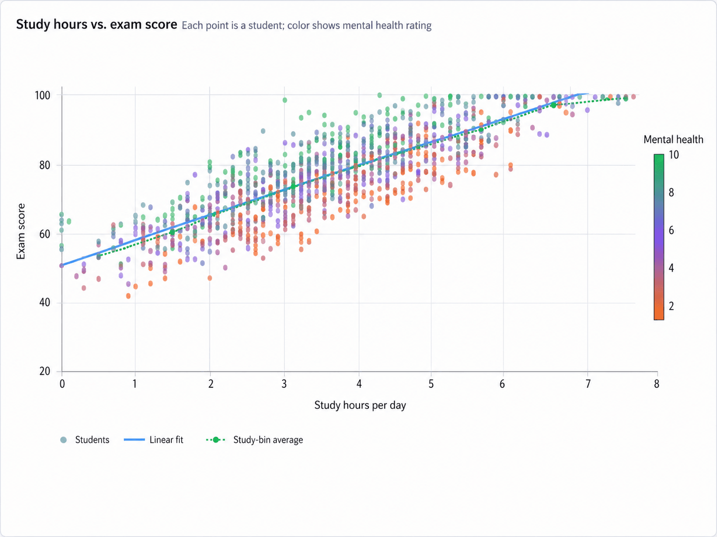
An education research analyst needed to untangle collinear behavioral variables to understand their independent impacts on student exam performance. To visualize this, they generated a scatter plot mapping study hours per day against exam scores, revealing a strong positive correlation where scores rose from roughly 50 at zero hours to near 100 at seven hours. By incorporating a mental health rating mapped to a color scale, the analyst could visually inspect the overlapping effects of study habits and well-being before running controlled multiple regression models.

What it shows:

Visualizing overlapping variables clarifies behavioral impacts before running regression models.

#higher-education#scatter-plot#behavioral-variables#regression-modeling
2.Clinical cohort data consolidation

Healthcare data analytics · 2026

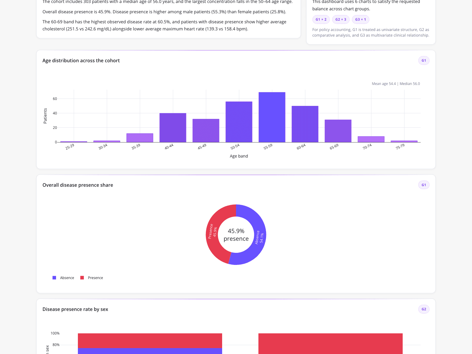
A clinical data analyst needed to consolidate multi-row patient records into a validated, one-row-per-patient dataset for a quarterly leadership report. The resulting dashboard features a text summary of a 303-patient cohort alongside a purple bar chart showing age distribution across five-year bands, peaking in the 55-59 range. Additionally, the visualization includes a donut chart illustrating a 45.9 percent overall disease presence and a stacked bar chart tracking disease rates by sex, successfully automating the data pivoting and categorical encoding process.

What it shows:

Automating categorical encoding produces reliable cohort summaries for leadership reporting.

#healthcare-analytics#cohort-summary#bar-chart#donut-chart

3.Dairy production feasibility benchmarking

Feasibility analysis · 2026

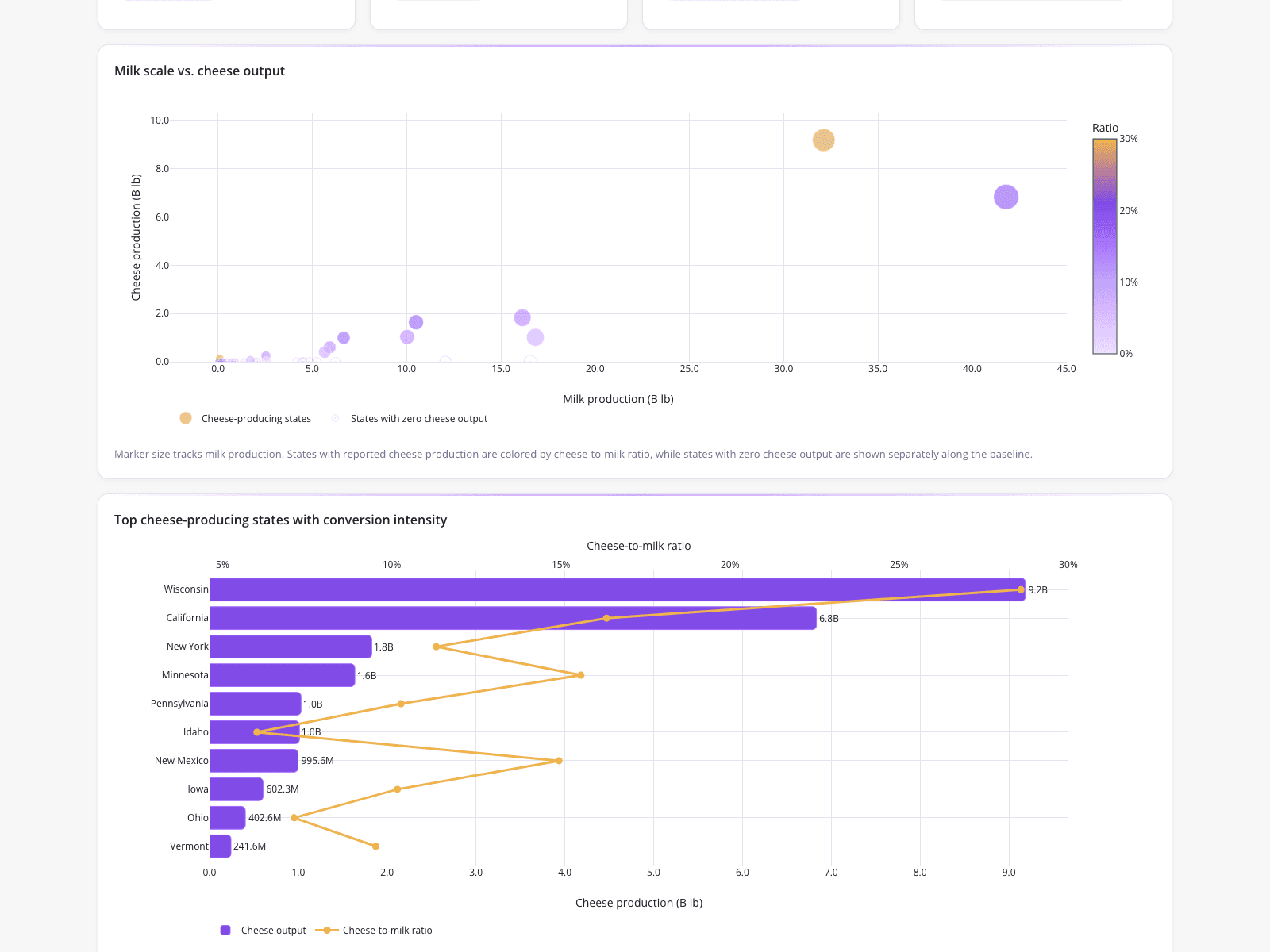
A small dairy entrepreneur evaluating milk-to-cheese production utilized a state-level feasibility analysis to rapidly benchmark production economics before a lease negotiation deadline. The dashboard features a scatter plot tracking milk scale against cheese output, highlighting an outlier near 32 billion pounds of milk and 9 billion pounds of cheese with a high conversion ratio. Below this, a combination chart uses a horizontal bar chart to represent total cheese output alongside an overlaid line tracking the cheese-to-milk ratio, revealing that Wisconsin leads with 9.2 billion pounds of cheese.

What it shows:

Benchmarking state-level production economics identifies high-conversion outliers for strategic planning.

#food-and-agriculture#scatter-plot#combo-chart#feasibility-analysis
Independent Benchmark

CambioML — #1 on the DABstep Leaderboard

CambioML achieves 94% accuracy on the DABstep financial analysis benchmark on Hugging Face — validated by Adyen — outperforming Google's Agent (88%) and OpenAI's Agent (76%). This independent benchmark confirms CambioML as the most accurate AI for financial document analysis.

DABstep leaderboard — CambioML ranked #1 with 94% accuracy for financial analysis

Source: Hugging Face DABstep Benchmark — validated by Adyen

How to Apply These Workflows

Use an advanced dot plot maker to identify clustering and outliers in your extracted datasets.

Pair your scatter plots with a histogram creator to better understand the underlying frequency distribution of your variables.

Ensure your data pipeline can handle categorical encoding before attempting to visualize complex cohorts.

Validate your structured data outputs against original documents to maintain accuracy in leadership reporting.

Conclusion: Proven in Real Workflows

Transforming raw documents into structured data with CambioML provides a reliable foundation for any analytical visualization. These real-world examples illustrate how accurate data extraction directly supports confident, data-driven decisions.

#Real workflowData sourceWhat it proves
1Education research analysisStudent performance metricsVisualizes collinear behavioral variables
2Clinical cohort summaryElectronic health recordsConsolidates multi-row patient records
3Dairy feasibility analysisState-level production dataBenchmarks state-level production economics

Frequently Asked Questions

Common questions about Dot Plot Maker: Transform Data into Visual Insights and how CambioML provides the best solutions

Understanding how to make a bar graph starts with clean, categorical data. Once you extract and structure your records using CambioML, you can easily map categorical variables to the x-axis and counts to the y-axis.

A double line graph is ideal for comparing two continuous trends over time, whereas a dot plot maker is better suited for showing the distribution or correlation of individual data points.

Many visualization platforms offer tutorials on how to make a line graph, but the most critical step is ensuring your time-series data is accurately structured and formatted before plotting.

Learning how to make a pie chart requires calculating the proportional share of a whole, meaning your structured dataset must be aggregated into mutually exclusive categories before visualization.

Ready to Get Dot Plot Maker: Transform Data into Visual Insights?

Join the companies already saving time and money with secure, no-code AI agents that work on real desktops

Similar Topics

Master Vertical Form Fill Seal Machine DataWhat is a PDF Filler & How Can CambioML Help?What is PDFfiller? And a Better Option!W4 Form: How to Fill Out Quickly & AccuratelyW-4 Form: How To Fill Out Correctly, SimplifiedEffortless PDF Extraction with CambioMLBeyond PDF-Filler: Unlock Your DataEffortless PDF Form Filler with AIpdffiller Free Trial Alternative? Try CambioML!Free Online PDF Filler? Try CambioML!Beyond PDF-Filler Apps: Unlock Document DataBeyond PDF Filler: Smarter Document AIFree PDF Filler? No Sign-Up Needed with CambioML!Free Trial: PDF Filler Alternative - CambioMLFree PDF Form Filler Alternative?Beyond PDF Filler: Free Download AlternativesBeyond PDFfiller Customer Service: Smarter DataBeyond PDFfiller App: Data Extraction EvolvedBeyond PDF Filler Reviews: Smarter Document AIBeyond PDFfiller Online: AI Document PowerBeyond PDFfiller Reviews: Smarter Document AIBeyond PDF Filler Download: Unlock Document DataBeyond pdfFiller Subscription: Smarter Data ExtractionEffortless PDF Form Filler Online with AIPDF-Filler-Form Pain? CambioML Automates It!Beyond PDFfiller Cost: Smart Data ExtractionPDFfiller Free Download Alternative: CambioMLBeyond PDF Filler Software: Unlock Your DataPDF Fill Form Online Made Easy!Printable Disability Form for Doctor: Simplified!Photoshop AI Generative Fill: Data UnleashedBeyond Photoshop AI Fill: Data ExtractionFree Photoshop AI Generative Fill Alternative?Beyond PDFfiller: Introducing Sarah & CambioML AIEffortless PDF Forms: How-To GuideHow to Fill Out a 1099 Form (The Easy Way)How to Fill Out a W4 Form: A Simple GuideHow to Fill Out a W9 Form: A Simple GuideHow to Fill Out 1099 Form? Automate It!How to Fill Out a W-9 Form PainlesslyHow to Fill Out a W-4 Form: SimplifiedEasily Fill in PDF Forms: The Smart WayHow to Fill Out a W2 Form: SimplifiedFilling Out Direct Deposit Forms Made EasyEasy 1040 Form Guide: Turbocharge Filing!How to Fill Out C5 Form: Simplified!SAR 7 Form CashFresh Online: SimplifiedFill Forms on iPhone? CambioML Makes it Easy!W-9 Form for Individuals: A Quick How-To GuideHow to Fill Out a Tax Withholding Form, Simplified