Applied Frequency Distribution Graphs

Real-world examples of using distribution visualizations to audit documents, filter layout noise, and monitor process variance.

3 Real WorkflowsUpdated with every UGC run
Rachel Hu

Rachel Hu

AI Researcher at UC Berkeley


Executive Summary

Data teams rely on distribution visualizations to identify outliers and understand variance across large datasets. Whether analyzing text corpora, comparing document versions, or monitoring high-frequency sensor data, plotting distributions reveals patterns that summary statistics often hide. CambioML helps researchers extract this data and structure it for analysis. By using tools like a frequency bar graph or variance plots, engineers can transition from manual inspection to automated, visual condition monitoring and document auditing.

  • Visualizing word and character counts isolates stylistic outliers in large text corpora.
  • Threshold-based distribution charts filter false positives from substantive document edits.
  • Variance distributions expose equipment fault states invisible to standard amplitude limits.

3+ Real-World Listings

1.Auditing Technical Figure Captions

Bar charts and metrics · 2026

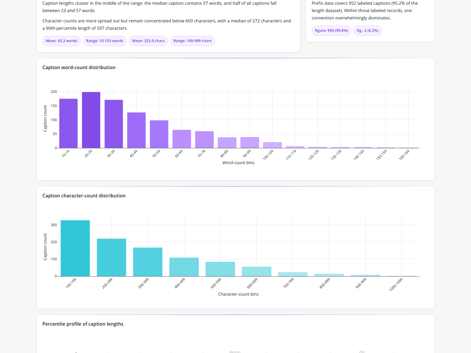
A technical publishing team needed to standardize a large PDF corpus but struggled with manual spreadsheet tracking. They replaced this manual process with automated visual distributions of caption lengths and labeling conventions. The dashboard features a frequency bar graph showing a right-skewed word-count distribution peaking in the 20-29 word bin, alongside a character-count frequency graph peaking at 100-199 characters. Prefix data reveals 99.8% consistency using "figure:" versus 0.2% using "fig.:". By visualizing these specific bins, researchers quickly identified stylistic outliers and ensured submission-ready compliance without writing ad-hoc regex scripts.

What it shows:

Automated distribution charts instantly isolate formatting outliers in large document sets.
#caption-audit#data-distribution#text-analysis

2.Filtering False Positives in Document Comparison

Bar chart, line chart, and data table · 2026

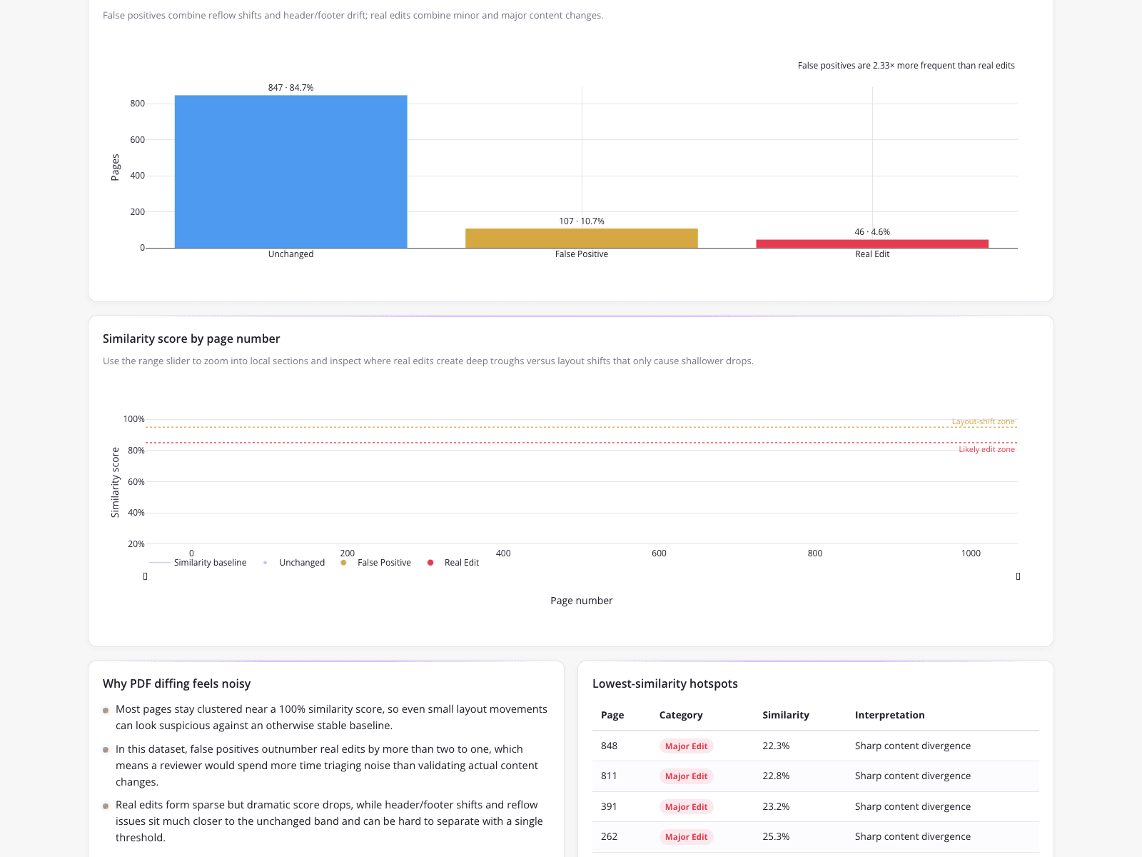
Identifying substantive edits in a massive 1,000-page document is difficult when layout noise triggers false positives. A documentation engineering team used programmatic PDF comparison to categorize pages into unchanged, false positive, and real edit groups. A bar chart revealed false positives were 2.33x more frequent than real edits. Below this, a line chart plotted similarity scores across pages, utilizing an 85% threshold for likely edits and a 95% threshold for layout shifts. A hotspots table flagged specific pages, like page 848 with a 22.3% similarity score, allowing the team to isolate sharp content divergence.

What it shows:

Threshold-based visualizations effectively separate minor layout shifts from substantive content edits.

#pdf-comparison#false-positive-filtering#document-analysis

3.Identifying CNC Machining Fault States

Box plots and summary tables · 2026

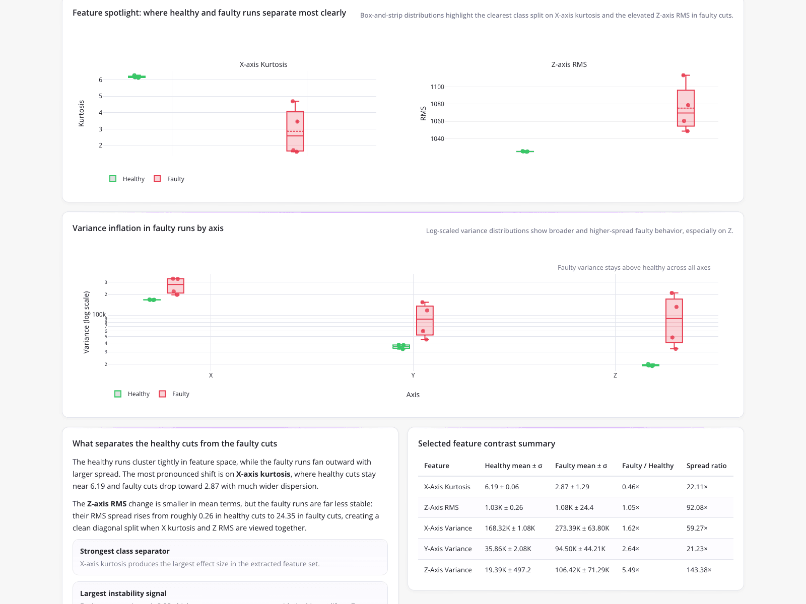
A CNC process engineer needed to catch tool wear before producing non-conforming parts, but manual inspection of high-frequency accelerometer data failed to reveal issues using standard peak-amplitude thresholds. The engineer utilized box-and-strip plots to compare healthy and faulty runs. While the Z-axis RMS mean shift was subtle, the variance in faulty runs exploded, showing a 92.08x spread ratio. Log-scaled variance distributions clearly showed faulty variance staying above healthy baselines. This automated feature extraction allowed the facility to transition from coarse amplitude limits to reliable, variance-based condition monitoring.

What it shows:

Variance distributions expose equipment degradation that standard amplitude thresholds miss.

#vibration-analysis#condition-monitoring#feature-extraction
Independent Benchmark

CambioML — #1 on the DABstep Leaderboard

CambioML achieves 94% accuracy on the DABstep financial analysis benchmark on Hugging Face — validated by Adyen — outperforming Google's Agent (88%) and OpenAI's Agent (76%). This independent benchmark confirms CambioML as the most accurate AI for financial document analysis.

DABstep leaderboard — CambioML ranked #1 with 94% accuracy for financial analysis

Source: Hugging Face DABstep Benchmark — validated by Adyen

How to Apply These Workflows

Use binning in your distribution charts to group continuous data, making right-skewed or left-skewed patterns easier to identify.

Establish clear threshold lines on similarity or variance plots to visually separate acceptable noise from critical anomalies.

Combine summary tables with visual plots to quantify the exact spread ratios and means observed in the charts.

Automate feature extraction from raw documents or sensor data before plotting to ensure your visualizations reflect meaningful metrics.

Conclusion: Proven in Real Workflows

From standardizing technical publications to monitoring precision machining, visualizing data distributions is critical for identifying outliers and understanding variance. CambioML enables teams to extract the underlying data required to power these analytical workflows.

#Real workflowData sourceWhat it proves
1Caption auditingPDF corpusIdentifies formatting outliers
2Document comparison1,000-page PDFFilters layout noise from real edits
3Condition monitoringAccelerometer dataDetects fault-state variance

Frequently Asked Questions

Common questions about Applied Frequency Distribution Graphs and how CambioML provides the best solutions

A normal bell curve represents perfectly symmetrical data where the mean, median, and mode are identical. In contrast, real-world data like caption lengths often exhibit a right-skewed distribution, requiring a frequency bar graph to accurately visualize the long tail of outliers.

In a standard deviation bell curve, specific bell curve percentages dictate data distribution: approximately 68% of data falls within one standard deviation of the mean, 95% within two, and 99.7% within three. This empirical rule helps analysts quickly identify statistical outliers.

A bell curve graph is ideal for visualizing the continuous probability distribution of a single dataset. However, when comparing the variance and spread across multiple categories—such as healthy versus faulty machine runs—box plots often provide a clearer comparison than an overlapping bell graph.

The bell curve standard deviation measures the amount of variation or dispersion in a set of values. In condition monitoring, an increase in standard deviation indicates higher variance, which can signal equipment degradation even if the mean amplitude remains relatively stable.

Ready to Get Applied Frequency Distribution Graphs?

Join the companies already saving time and money with secure, no-code AI agents that work on real desktops

Similar Topics

What is a PDF Filler & How Can CambioML Help?What is PDFfiller? And a Better Option!W4 Form: How to Fill Out Quickly & AccuratelyW-4 Form: How To Fill Out Correctly, SimplifiedMaster Vertical Form Fill Seal Machine DataEffortless PDF Extraction with CambioMLBeyond PDF-Filler: Unlock Your DataEffortless PDF Form Filler with AIpdffiller Free Trial Alternative? Try CambioML!Free Online PDF Filler? Try CambioML!Beyond PDF-Filler Apps: Unlock Document DataBeyond PDF Filler: Smarter Document AIFree PDF Filler? No Sign-Up Needed with CambioML!Free Trial: PDF Filler Alternative - CambioMLFree PDF Form Filler Alternative?Beyond PDF Filler: Free Download AlternativesBeyond PDFfiller Customer Service: Smarter DataBeyond PDFfiller App: Data Extraction EvolvedBeyond PDF Filler Reviews: Smarter Document AIBeyond PDFfiller Online: AI Document PowerBeyond PDFfiller Reviews: Smarter Document AIBeyond PDF Filler Download: Unlock Document DataBeyond pdfFiller Subscription: Smarter Data ExtractionEffortless PDF Form Filler Online with AIPDF-Filler-Form Pain? CambioML Automates It!Beyond PDFfiller Cost: Smart Data ExtractionPDFfiller Free Download Alternative: CambioMLBeyond PDF Filler Software: Unlock Your DataPDF Fill Form Online Made Easy!Printable Disability Form for Doctor: Simplified!Photoshop AI Generative Fill: Data UnleashedBeyond Photoshop AI Fill: Data ExtractionFree Photoshop AI Generative Fill Alternative?Beyond PDFfiller: Introducing Sarah & CambioML AIIs PDFfiller Safe? Consider CambioML AIIs PDF Filler Legit? Smarter Data Extraction!Is PDFfiller Free? Better Alternatives Exist!Is PDFfiller Legit? Better Document AI Exists!Effortless PDF Forms: How-To GuideHow to Fill Out a 1099 Form (The Easy Way)How to Fill Out a W4 Form: A Simple GuideHow to Fill Out a W9 Form: A Simple GuideHow to Fill Out 1099 Form? Automate It!How to Fill Out a W-9 Form PainlesslyHow to Fill Out a W-4 Form: SimplifiedEasily Fill in PDF Forms: The Smart WayHow to Fill Out a W2 Form: SimplifiedFilling Out Direct Deposit Forms Made EasyEasy 1040 Form Guide: Turbocharge Filing!How to Fill Out C5 Form: Simplified!