1.Isolating Clinical Predictors with Feature Discrimination
Horizontal bar chart and heatmap · 2026
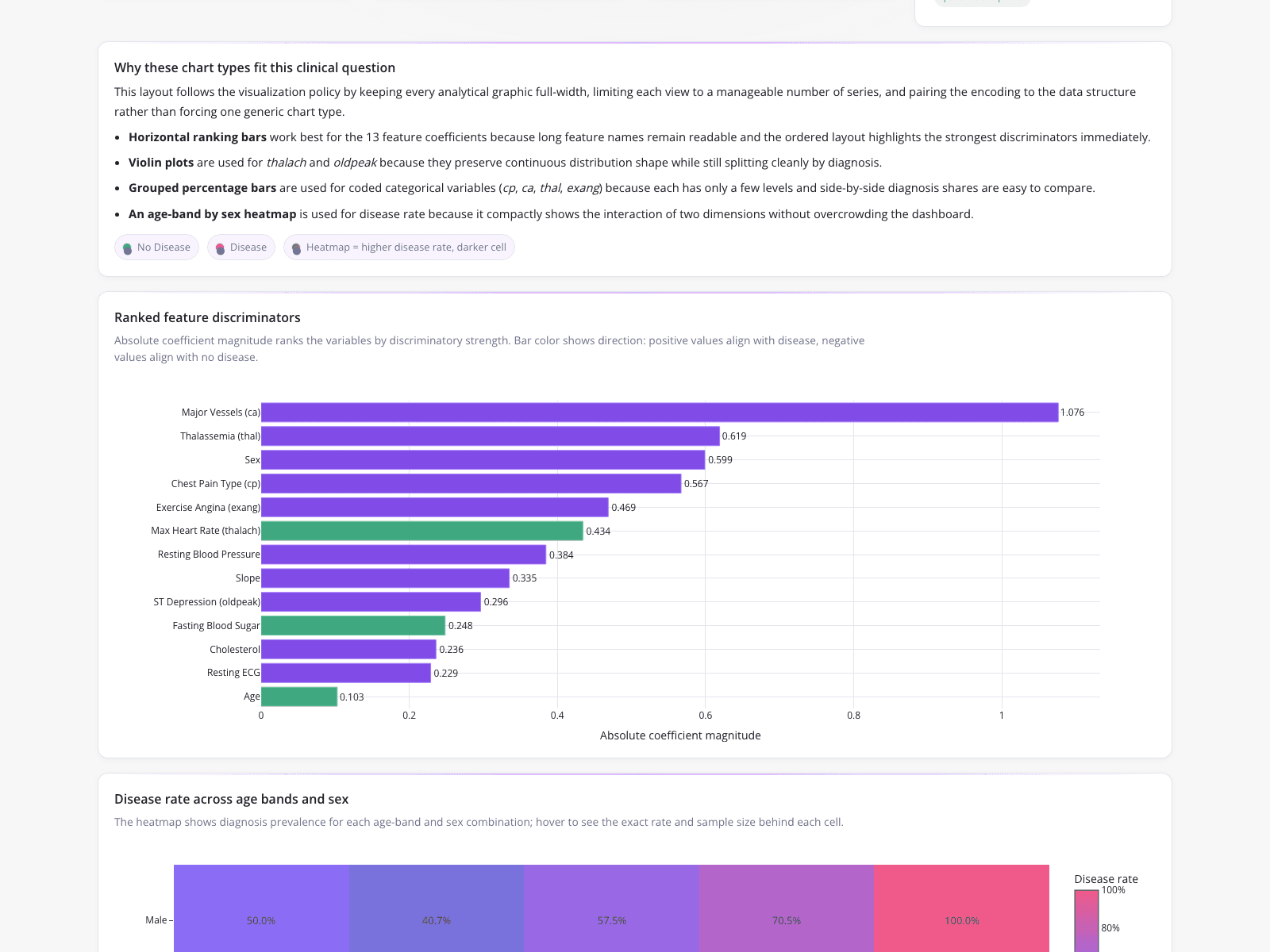
A clinical data analyst needed to identify true predictors of heart disease by separating signal from noise. To control for demographic confounders, the analyst evaluated independent predictive power. The dashboard features a "Ranked feature discriminators" bar chart, showing "Major Vessels (ca)" as the strongest predictor at 1.076, followed by "Thalassemia" at 0.619. Conventional markers like "Resting Blood Pressure" (0.384) ranked lower. A supplementary heatmap titled "Disease rate across age bands and sex" visualizes diagnosis prevalence, showing male disease rates escalating from 40.7% to 100.0% in the highest age bracket.
What it shows:
Ranking variables by absolute coefficient magnitude helps update triage protocols using statistically defensible data rather than opaque spreadsheets.