1.Clinical Correlation and Distribution Analysis
Exploratory Data Analysis · 2026
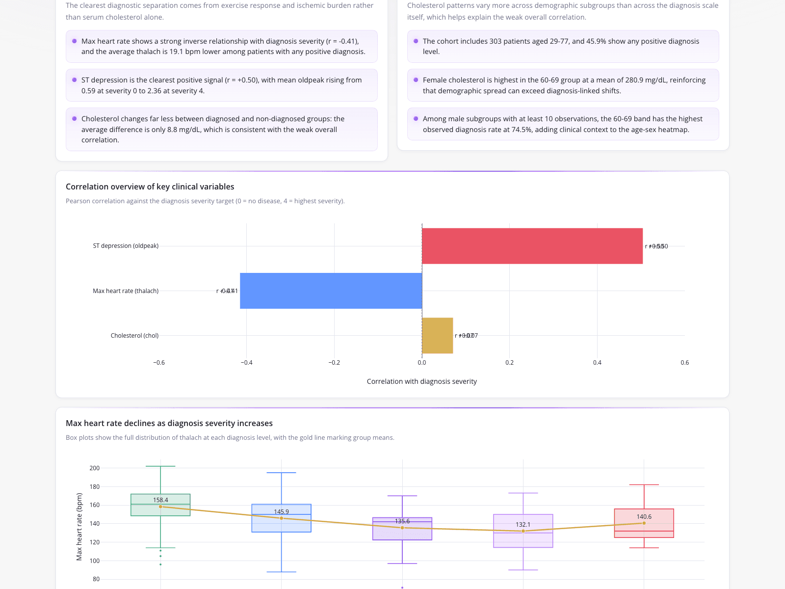
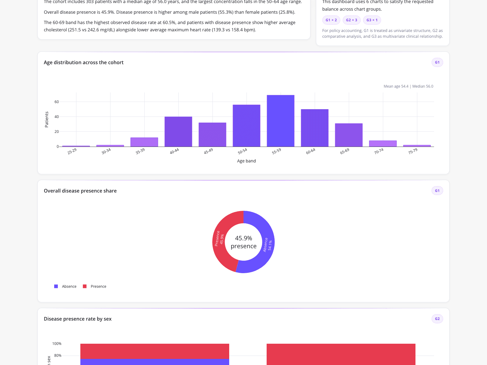
A clinical data analyst used this dashboard to consolidate exploratory data analysis and reporting into a single deliverable. The top section highlights demographic metrics for a 303-patient cohort aged 29-77, noting that female cholesterol peaks at a mean of 280.9 mg/dL in the 60-69 age group. A horizontal bar chart visualizes the Pearson correlation of key clinical variables against diagnosis severity, contrasting ST depression (0.50) and max heart rate (-0.41). Finally, box plots demonstrate how max heart rate declines as diagnosis severity increases, dropping from 158.4 bpm to 132.1 bpm before rising to 140.6 bpm, illustrating a complex multivariate relationship.
What it shows:
How to visualize correlations and distributions across severity levels.