1.Clinical Correlation and Diagnosis Severity
Clinical Analytics · 2026
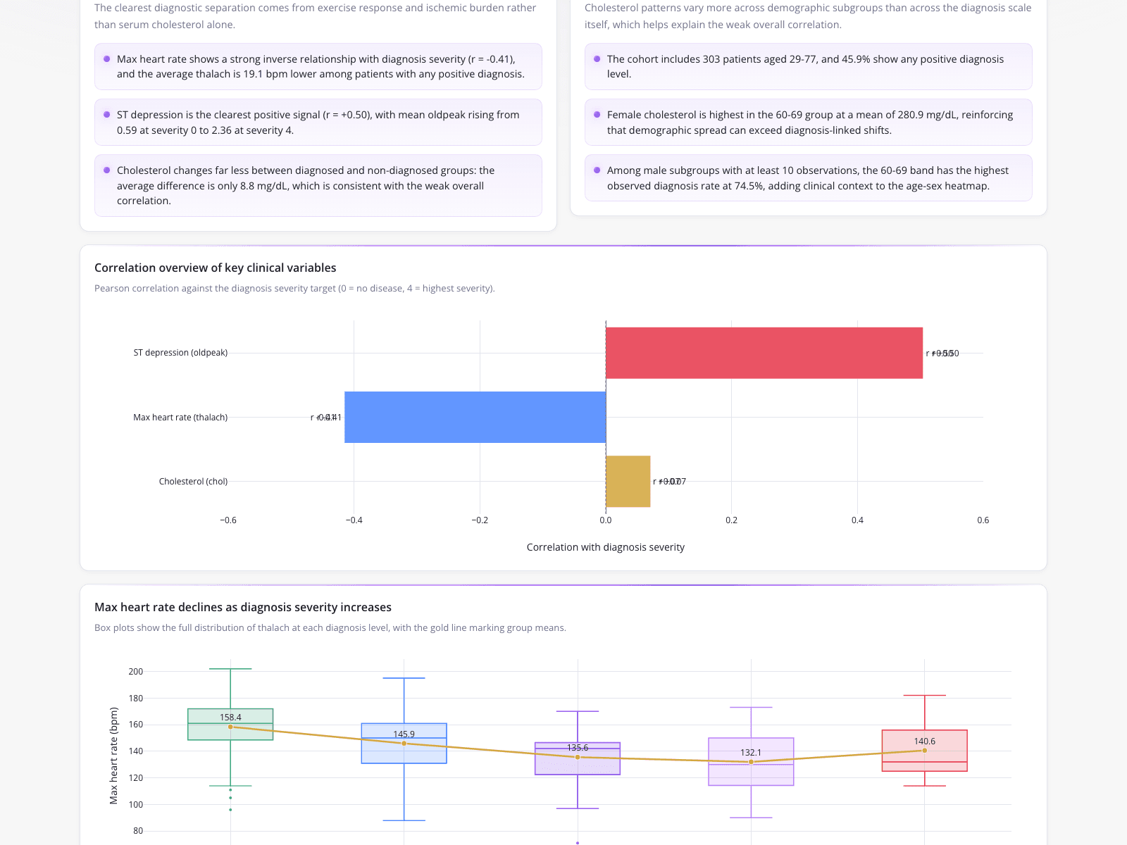
A clinical data analyst used a dashboard to consolidate exploratory data analysis and reporting into a single deliverable. The analysis evaluated a categorical variable—diagnosis severity—against numerical data examples like max heart rate and ST depression. Text summaries noted a 303-patient cohort aged 29-77, with female cholesterol peaking at a mean of 280.9 mg/dL in the 60-69 age group. A horizontal bar chart visualized Pearson correlations, contrasting ST depression (0.50), max heart rate (-0.41), and cholesterol (0.07). Finally, box plots displayed the distribution of data for heart rates across five severity levels, showing means dropping from 158.4 bpm to 132.1 bpm before rising to 140.6 bpm.
What it shows:
How to visualize the relationship between continuous metrics and ordinal categories.